progress pathways
A warm, kid-friendly brand that inspires trust
branding, collateral
Meet
Progress Pathways
Progress Pathways is a true inspiration: an occupational therapy and speech pathology clinic that supports Brisbane kids to make the progress that matters and enjoy more opportunities to thrive.
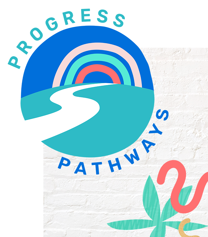
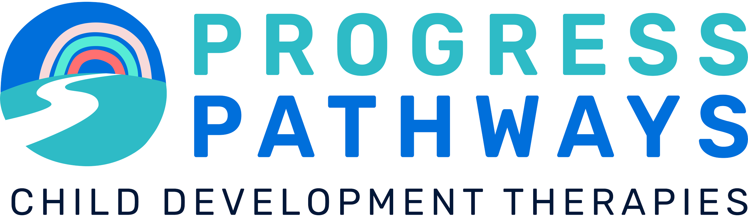
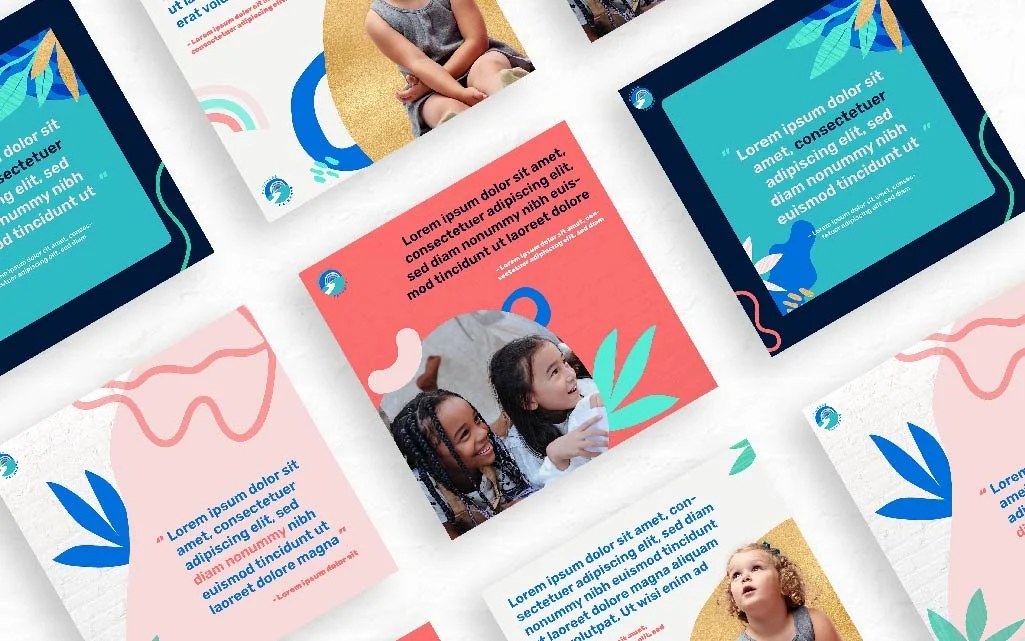
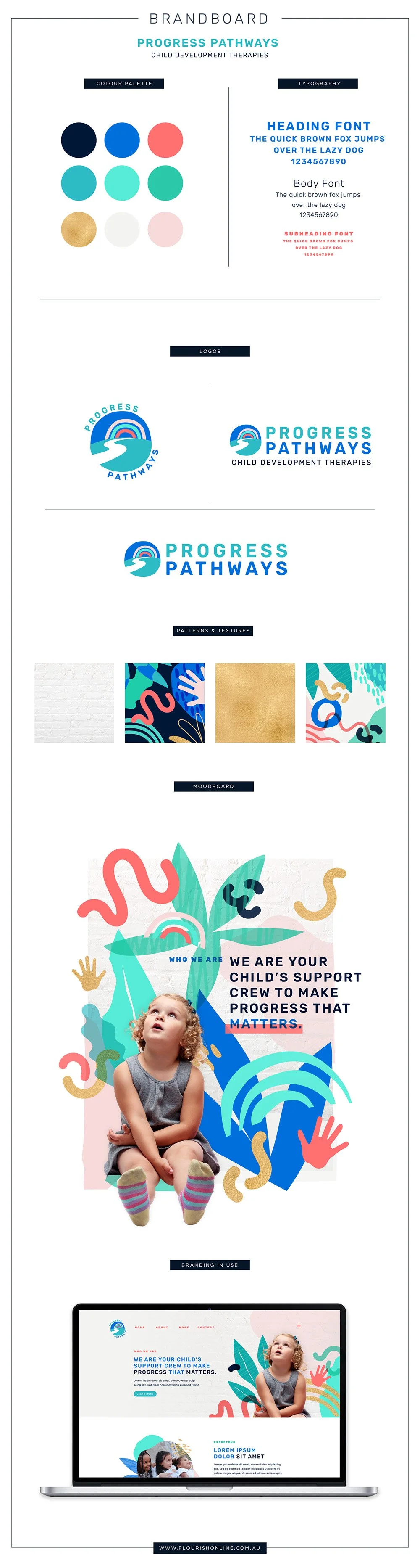
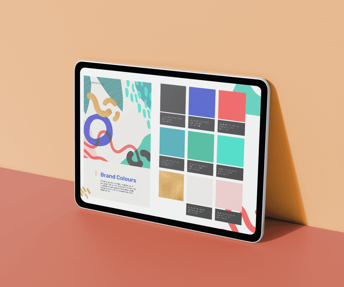
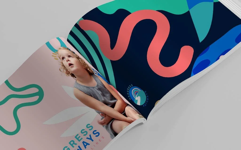
When Progress Pathways asked for our help with a visual rebrand, including a new logo, social media templates and branding kit, we felt inspired to create a brand worthy of their passion and care, with a fun moodboard filled with organic shapes, squiggles, hands, leafy designs, and splashes of bold aqua, cobalt blue, soft pink, warm coral, beige, and black. Progress Pathways’ new logo - featuring a rainbow and hill with a path - takes pride of place in their stunning new marketing collateral.
The Brand


“Lorem ipsum dolor sit amet, consectetur adipiscing elit, sed do eiusmod tempor…”
incididunt ut labore et dolore magna aliqua. Ut enim ad minim veniam, quis nostrud exercitation ullamco laboris nisi ut aliquip ex ea commodo consequat. Duis aute irure dolor in reprehenderit in voluptate velit esse cillum dolore eu fugiat nulla pariatur. Excepteur sint occaecat cupidatat non proident.
Client name, client credentials. clientwebsite.com