Sherrie hardy / hardy learning
A polished modern brand for an inspirational education organization
BRANDING, membership site

Meet
Sherrie Hardy
For two decades, Sherrie Hardy, founder of Hardy Learning, has led the charge to create a stronger learning foundation for kids with learning and processing difficulties, so they can become more confident students.
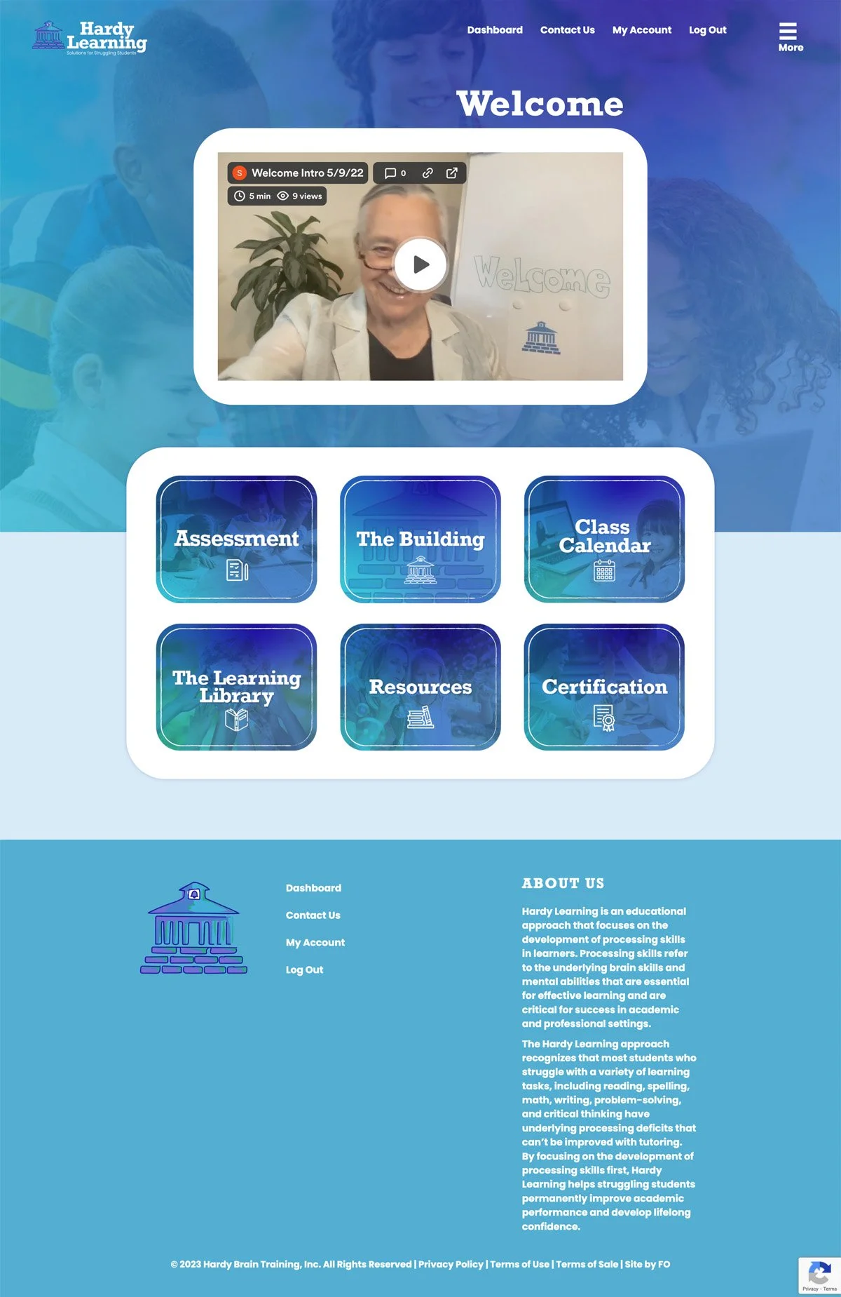
After twenty years and a business name change, Sherrie knew she needed to bring her brand into the 2020s. The most important thing: that her rebrand felt professional yet welcoming for students and parents alike. To meet this brief, we opted for a bright, trust-enhancing blue-based colour palette that felt fresh and optimistic.
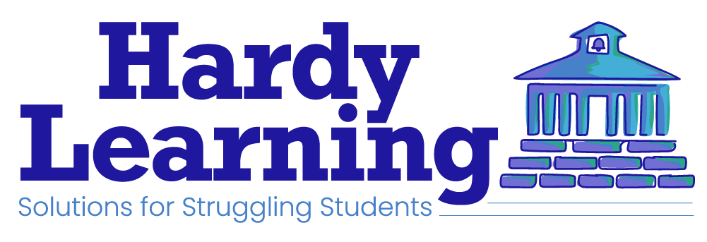
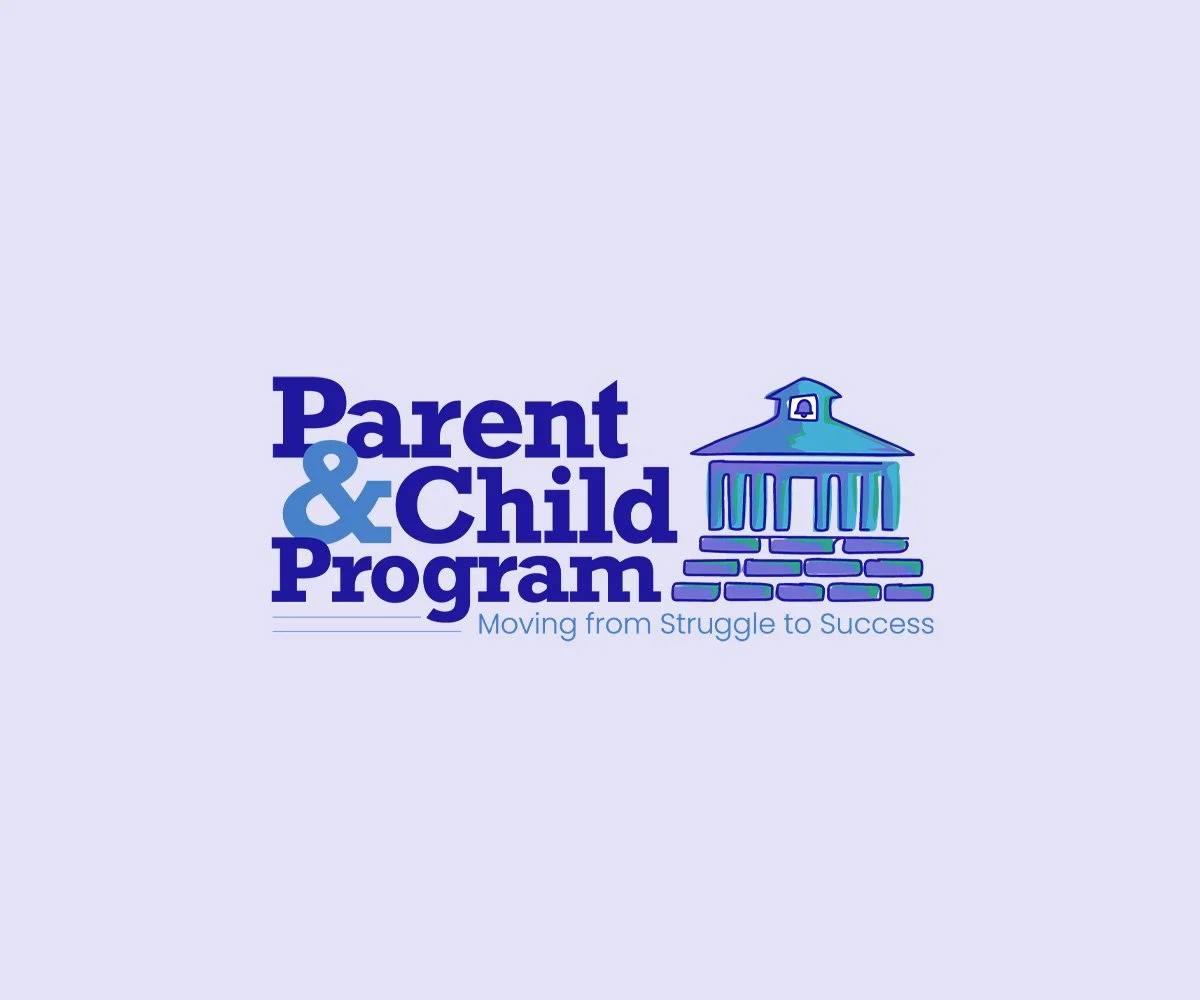
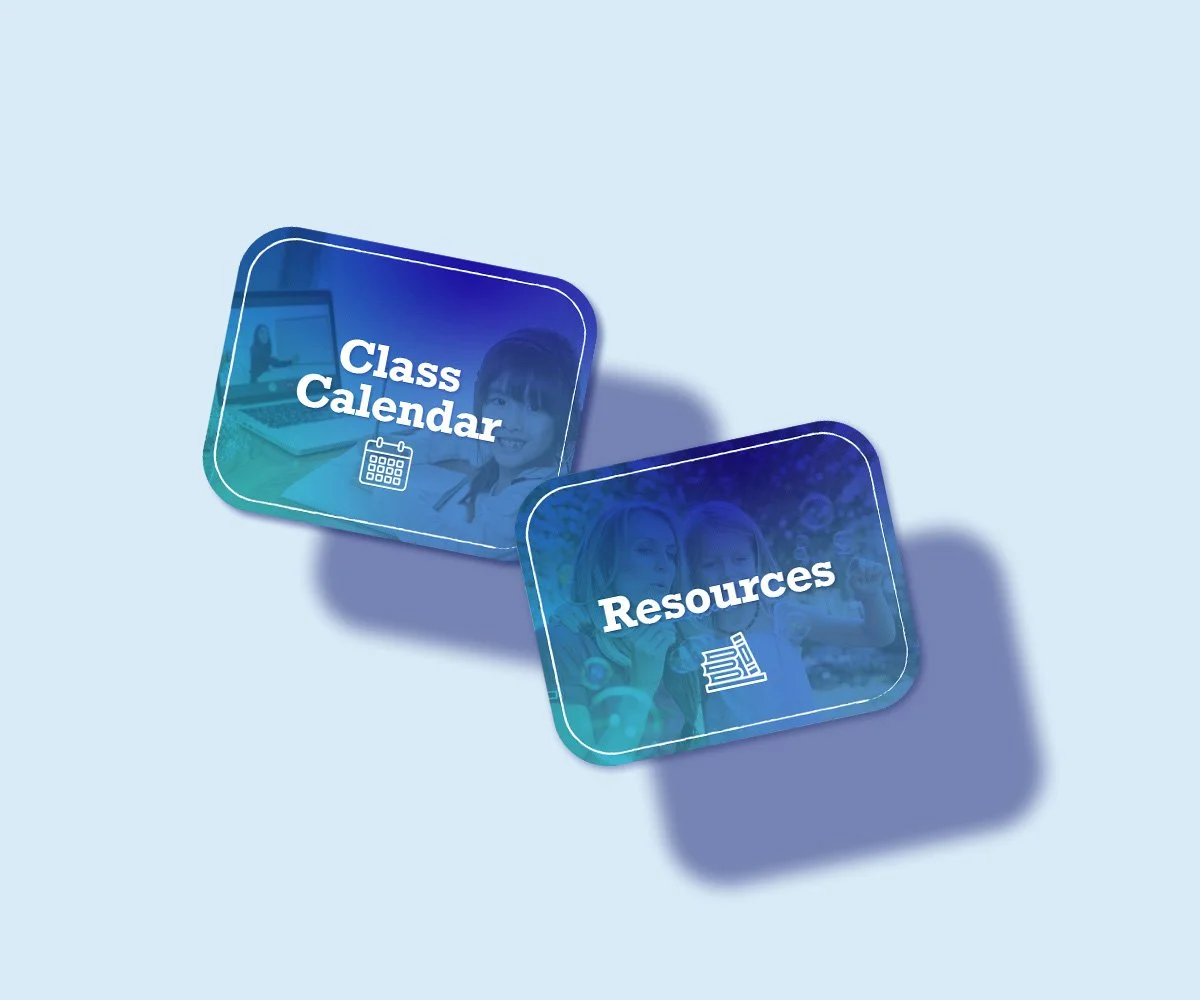
We liked how the geometric sans serif display font Rockwell appears mechanical and rigid at first, but reveals a charming friendliness on second glance - echoing how Hardy Learning makes learning approachable. We paired this Rockwell font with friendly Poppins body text. Inspired by Sherrie’s metaphor of education as a house, we crafted her new logo to look like a house with multiple pillars, with matching icon illustrations to guide the user’s journey throughout her website.