the globe and mail centre
A luxurious rebrand to attract more event bookings
branding, collateral, membership site, website
Meet
The Globe and Mail Centre
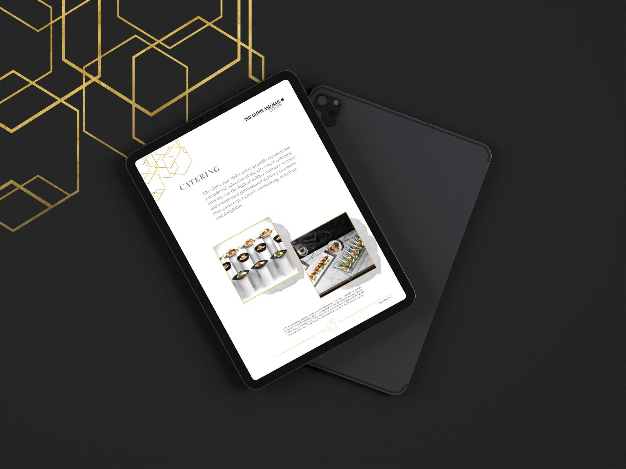
From the elegant handwritten script and classic serif display font to the sleek gold and neutral colour palette, every bit of the Globe and Mail Center’s website rebrand feels luxurious.
The perfect website for weddings and corporate events, the design interweaves gold leaf and hexagonal design elements with soft grey marble and watercolour textures - all while keeping the design spacious, clean and minimalist chic.


