
Time to get your pinnin' on.
In case you've been living under a rock and don't know what Pinterest is, watch the quick video below where Ellissa takes you through the steps to setting up a Pinterest account.
Warning: If you are visually inclined - Pinterest is addictive!
The Pinterest board is an essential part of your Branding Prep. If you don't do it, we can't start your project. Here's why it's important:
It gives us a way to tune into the words you are using and the things you are imagining. Your idea of "feminine" will vary vastly to the next person, so if you can *show* us what feminine means to you, we'll have a much better chance of creating the magic for you.
It helps you hone in on all the things buzzing around in your head. At the beginning of the process, you might be torn between Shabby Chic and Minimalism. Once you get some pins on the board and run them through your brand filter, you'll have a feeling that one direction is a better representation than the other.

The Brand Filter
You're going to come across a LOT of pins that you love on Pinterest. But your visual branding can't encompass everything.
Together, we'll work out what stays and what goes, but you need to begin this filtering process now so you can get the most out of our work together.
ASK: DOES THIS IMAGE CONVEY ANY OF MY BRAND CORE VALUES?
ASK: DOES THIS IMAGE BELONG IN MY BRAND, OR IN MY CUPBOARD/HOME/CAR/ON MY NEPHEW ETC.
ASK: AM I LOVING ALL OF THIS IMAGE OR ONLY PARTS OF IT? COMMUNICATE WHAT IS WORKING FOR YOU.
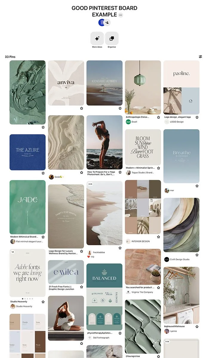
example: good pinterest board
In this short video, I show you what a "good for a design brief" Pinterest looks like.
"Good for Design" Pinterest boards have the following:
General atmospheric shots (think outdoors, interior design, catwalk). Images where you get a sense of environment.
Images that include the use of fonts you like.
Photos that evoke a feeling/core value/sense of an environment you want present in your branding.
Detailed views. Opt-ins that you saw and liked. Logos you like. Specific elements you like.
Colours and colour combinations you are drawn to (there's a load of psychology in colour and what you are naturally drawn to often reflects hidden desires about your image, or colours that are a natural fit for you).
NEED HELP?
Go back to your brand worksheet and start using search terms that use words used in your core brand values / brand vibe in conjunction with:
Interiors (eg "Fun" interiors)
Fonts (eg "Minimalist" fonts)
Photography
(eg "Feminine" photography)
Logos (eg "Bold" logos)
Textures (eg "Beachy Textures")
Quotes (eg "Brave Quotes").
Click the image to see
the board for yourself
example: bad pinterest board
In this quick video I show you what a "Bad for a design brief" Pinterest looks like.
"Bad for Design" Pinterest boards have the following:
Images of everything in the world that you have ever liked. You need to filter irrelevant ones out.
Randomness, or things you want to specifically copy.
We can't copy, but we can take inspiration from things.Less than 20 pins, more than 40.

Completing your Branding Brief has 4 Steps
BRAND IMMERSION WORKSHEET

YOU ARE HERE!
PINTEREST BOARD

LOGO BRIEF

BOOK A MEETING