Membership Site Design Secrets
Create a WOW membership / Ecourse experience for your students by considering these 9 tips.
1. Is it “On Brand” and a natural fit for the rest of your online platform?
There’s nothing weirder than purchasing something online, only to get access to a platform that looks nothing like the sales funnel you went through in order to get there.
Similarly, there is nothing that says “Hello Buyers Remorse” MORE than purchasing something from a beautiful sales page only to find the actual product is way, waaaayyyy more basic than the sales page.
It’s a hard call knowing whether to upgrade your sales page or your platform first. After all, the Sales Page does the selling. So thats UBER important. But the actual product - the membership platform and the content is what the customer is actually buying.
Our Tip: If you are seriously strapped for cash, the best thing you can do is keep your membership platform simple and elegant and invest in a gorgeous, high converting sales page (copy and design). We offer simple start up membership packages for people just starting out from just $3500 AUS.
Note: This resource contains endorsements for products and services, which means when you click on a link that we recommend, we may receive a commission. Not every link is an affiliate link, but some are.
2. Keep the Navigation Clear
The potential to get overwhelmed in an online platform is very strong. Clear navigation is one way you can help your students negotiate their way through the content.
If possible, keep your module navigation separate from your account navigation, and keep the navigation in the same spot on every page.
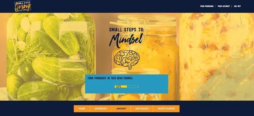
Example of separate navigation areas for content and account features:
If you are running multiple levels on one platform, it's also a good idea to keep some continuity between your different courses in the navigation area.
3. Help your students keep track of where they are up to.
We use and recommend Progress Ally to help your students keep track of their progress in the course. A simple module checklist is a great way to visually show students where they are up to and to encourage them to finish the content.
Examples: Small Steps Living Membership, built by us using Wordpress, Access Ally and Ontraport.
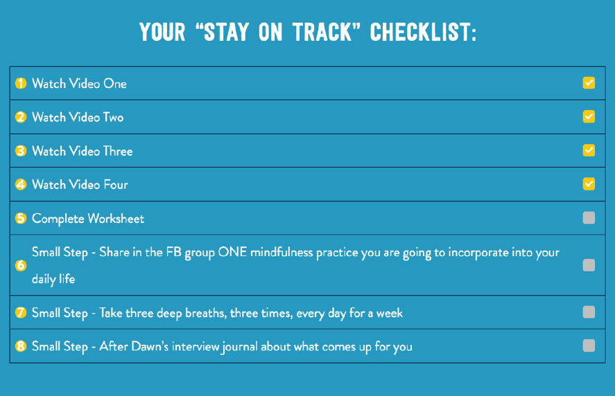
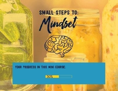
Remember: Students that complete content are happy students and are much more likely to recommend your course to others, so it's worth doing whatever you can to help them do that.
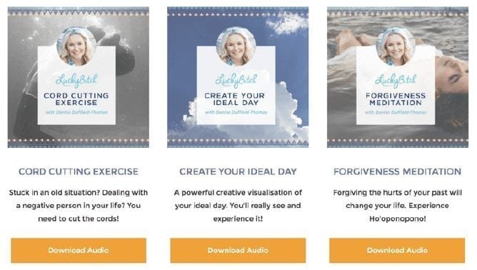
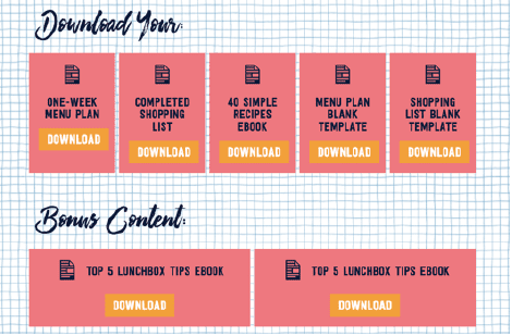
4. Are the content elements clearly presented?
Tying back into the potential to overwhelm factor - it's important to use your design to show students what is available to them and where.
Don’t just link to your downloadable content and bonus content - create buttons and place them strategically so your students understand:
Where to find everything
What good value they got in joining your program ;)
Examples: Lucky Bitch Manifesting Course, built by us using Wordpress. Integrated with Access Ally and Infusionsoft. Small Steps Living Membership, built by us using Wordpress, Access Ally and Ontraport.
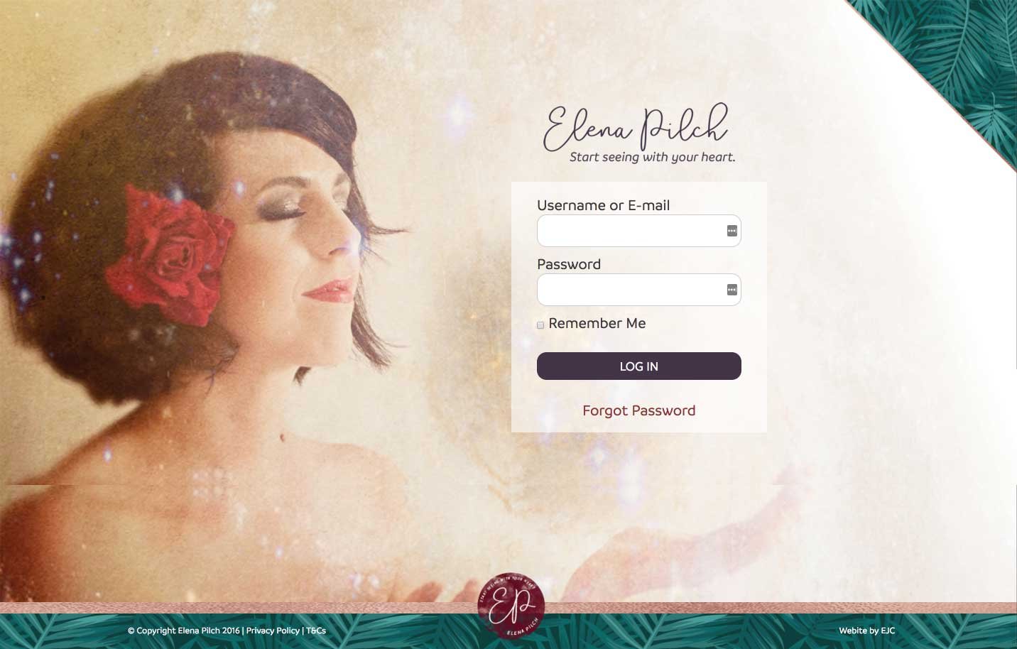
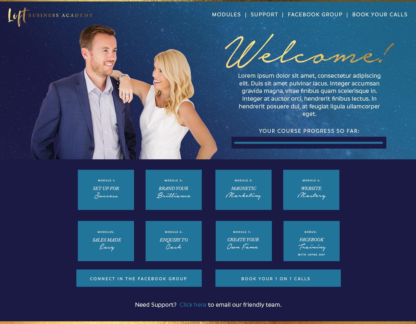
5. Is there a branded login experience and a Welcome Section?
Logging into a standard Wordpress login page = big disappointment. This is a little thing but a WOW login page is like having the welcome mat out for your tribe. Make the first impression count.
Further, when people log into your membership site for the first time they are PUMPED to get going. Make sure in your design you have a gorgeous welcome for them to keep spirits high.
Examples: Elena Pilch, built by us using Wordpress, MemberPress and Active Campaign.
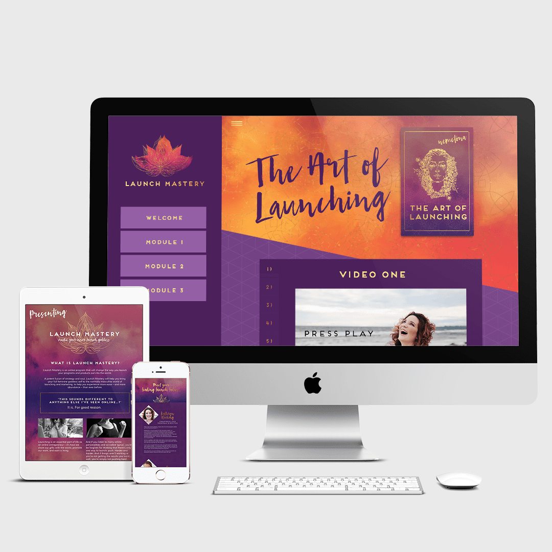
6. Is there a pic of you in the course platform?
People buy from people. It's a lovely touch to be present (visually) in the course, as when it comes down to it your students have chosen to buy from you because they like YOU.
Consider a big welcoming image of you on the dash, welcome page, wherever you can to build connection and loyalty to your brand.
Examples: Launch Mastery, built by us using Wordpress. Integrated with Access Ally and Infusionsoft.
7. Do your emails / Facebook group / supplementary design material match the sales and learning platform.
For the love of wine, make sure everything is branded consistently. Wherever your students are interacting with you and the material it has to be consistent. Inconsistency is the quickest way to losing brand credibility, to making you look like an amateur, and leaving a “meh” memory in the mind of your student.
8. Is it Mobile responsive?
It's basically nuts in 2018 to create anything online that isn’t mobile responsive. Your students will be learning on all types of different devices and your site needs to adapt naturally to accommodate for these devices.
All of our ecourses and memberships are mobile responsive, cause as I said, it would be nuts to create anything otherwise.
Simple.
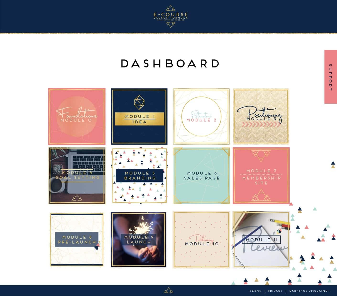
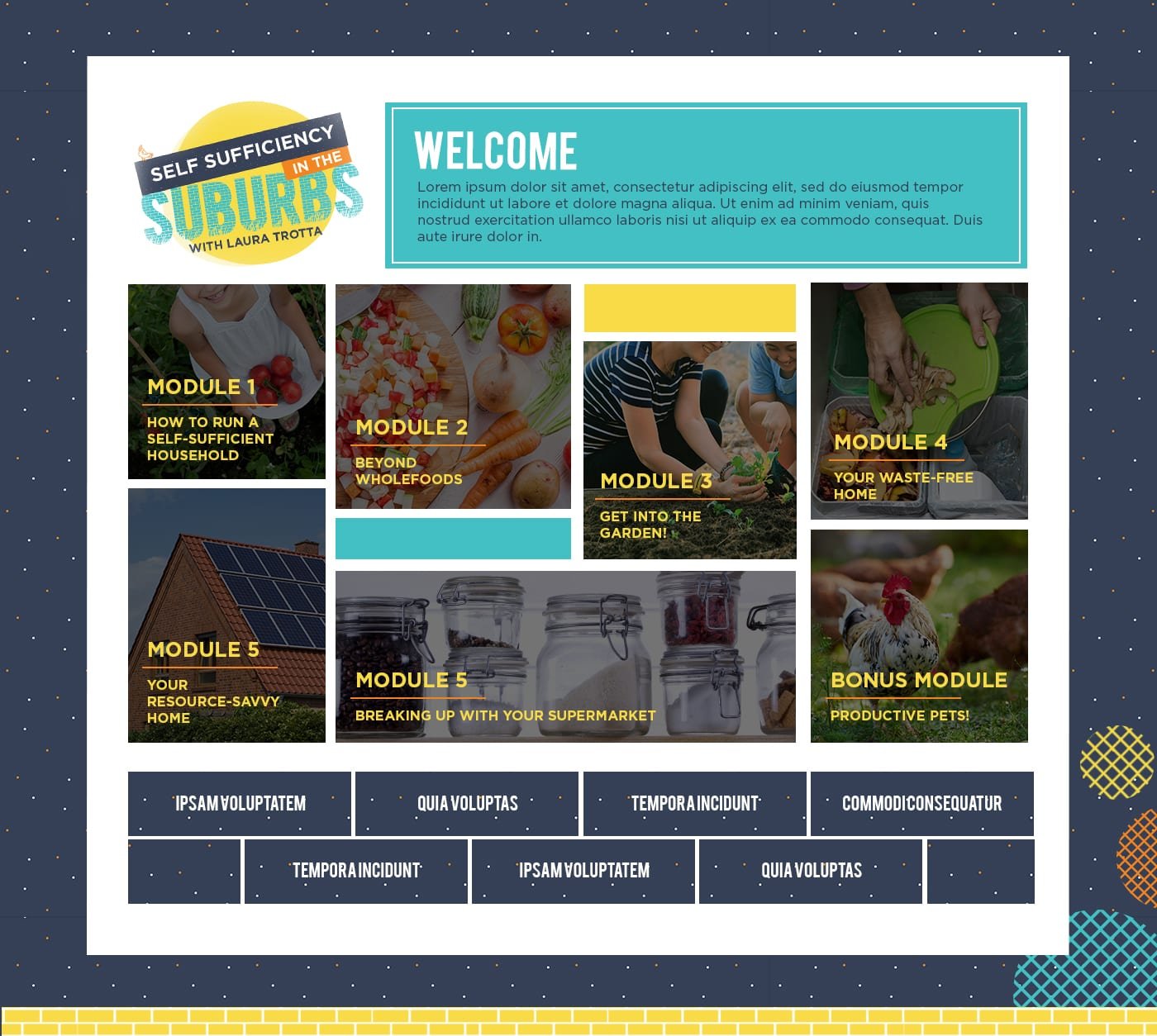
9. Is it hard to find your content if your student has a long break from the platform?
Most of your students won’t follow the course exactly as you have designed. They will fall behind, need to go over things, get interrupted. Designing a clear dashboard as the welcome mat to your course is essential to help them find what they need to find and learn what they need to learn.
A good dashboard has links to all your modules, support, community portals, and a my account page if you are taking reoccurring payments or multiple courses on the one platform. It's also handy to have a FAQ section where you can explain how to reset passwords and any other support related question that you get over and over again. Get these steps in place and you’ll spend less time in your inbox explaining how to do basic functions and more time developing content, sipping margaritas by the pool and creating a better course experience for your tribe.
Examples: She Gets Business, built by us using Wordpress. Integrated with Pilot Press and Ontraport. Self Sufficiency in the Suburbs, built by us using Wordpress, Access Ally and Ontraport. Ecourse Launch Formula, built by us using Wordpress. Integrated with Access Ally and Infusionsoft.
Need some Membership Site Examples?
You can find the links to all the membership sites we’ve built here.
If it’s time to take your online platform to the next level, we can help you transform.
Let's talk about your project.
Knowing which way to go on an online course platform is confusing, and there is no all in perfect solution for alllll the people.
Book a free consultation call where we can talk through your situation and work out the best way forward for your online business.

TAKE OUR QUIZ NOW TO DISCOVER YOUR BRAND ARCHETYPE SO YOU CAN BUILD THE RIGHT STRATEGIC FOUNDATION FOR YOUR ONLINE PRESENCE.