Best Author Websites of 2024 | 8 Inspiring Examples
Have you poured countless caffeinated hours and mind-body-and-soul passion into crafting a body of work that positions you as an expert in your field?
Maybe you’re in the process of writing a book slash magnum opus (no pressure) right now.
Pulling all that hard-won wisdom and knowledge in your head into a book that showcases your expertise? That’s a huge deal.
Go on, bask in the glory of your accomplishment (with an applause from us).
And once you’re ready, let’s talk about the best book author websites. So that when you’re ready to publish, you can launch your book baby into the world with the very best chance of finding its new home on the shelves of your ideal audience.
Why modern business owners need a website for their book
Your author website is so much more than a resume or even a platform to sell your book. It’s a powerful marketing and positioning tool for your entire brand.
The best author websites are great multitaskers. Not only do they help you make the right impression on book buyers and lift your credibility. The right author website will work hard for you, diversifying your income streams, positioning you as the go-to authority in your topic of expertise, and helping you snag coveted, prestigious speaking engagements.
If you build it right, your author website will help you secure paid opportunities and maximise all the hard work you’ve done so far (cause let’s face it, it’s unlikely that just selling your book is gonna make you rich).
Author Website Examples to Inspire You
The best author websites are beautiful, sure, but also strategic. Here are eight author websites that are sure to inspire you.
1. Esther Perel
Relationship expert Esther Perel, two-time TED speaker, author, consultant to brands and companies, and Fortune 100 Luminary, needs no introduction, but we’re gonna give her one anyway.
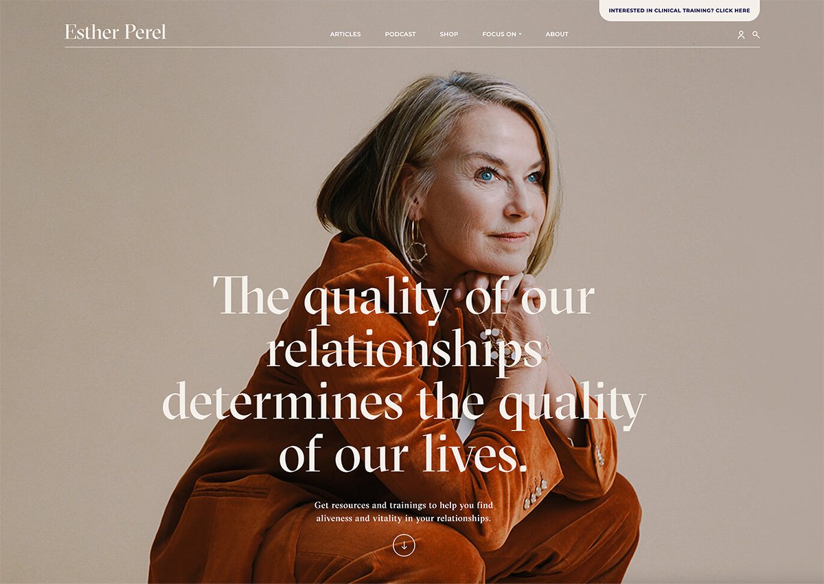
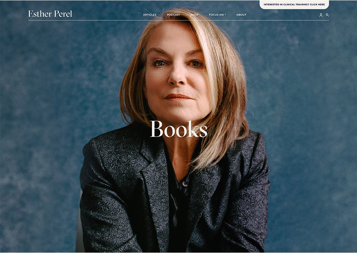
We love her insightful take on modern relationships. But as website designers, we can’t help but notice that Esther has a polished author website and impressive book page to match. Check out her website now if you want a top-tier example of how a well-branded author website can support and even amplify an expert’s thought leadership.
Let’s start with colour. Esther’s brand colours are elegant and airy, yet casually intimate. To echo Esther’s graceful but relaxed public persona, her designer opted for navy blues, various tints of warm beige, pinks and soft, muted creams (instead of the clinical bright white you see on most websites).
To complement this organic-feeling colour palette, Esther’s brand photography is minimalist with medium long shots that feel professional and authoritative without feeling distant or cold.
Her typography choices showcase this warm professionalism, too. The main display font, GT Sectra, combines the human warmth of calligraphy with the sharpness of a scalpel knife, while the friendly, approachable body font, Montserrat, delivers oodles of stylish simplicity with its lovely large x-height.
Overall, the website’s layout is clean and minimalist. The warm yellow buttons invite clicks with simple user-friendly copy that directs people where to buy her books in their local region online.
Bravo, Esther!
What you should steal: Take a cue from Esther Perel and focus on intentional branding and design first before rushing into your website design.
Your website should not only showcase your work but reflect your brand identity. A thoughtfully curated brand that reflects your personality can make a HUGE difference in how your audience perceives you and your work.
2. Dr Sarah McKay
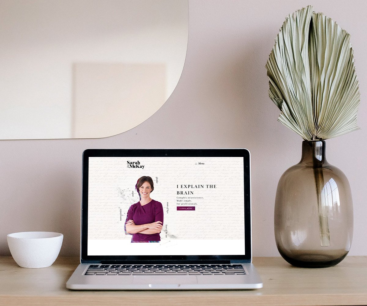
An author, speaker and director of Think Brain’s Neuroscience Academy, our dreamy client Dr Sarah McKay is an unstoppable force, helping coaches, therapists, teachers and other helping professionals thoughtfully apply insights and tools from neuroscience to their work.
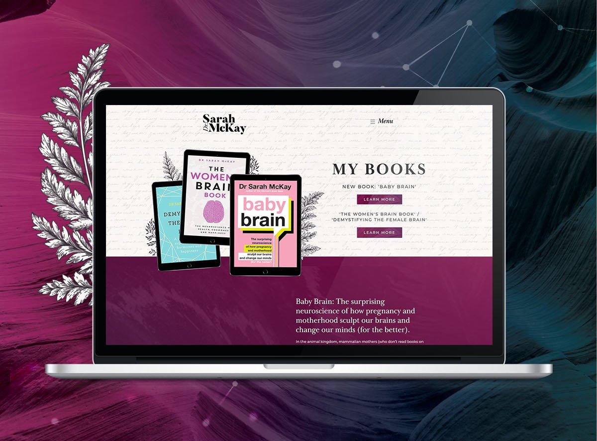
When we designed Dr Sarah McKay’s author website, we knew we wanted to shine a spotlight on her glorious body of work, including her two game-changing books for women, ‘Baby Brain’ and ‘The Women's Brain Book’. Not only did we put her books front-and-centre on her homepage, we made sure Sarah’s Books page is always accessible from anywhere on the website in one easy click.
To highlight Sarah’s expertise, the sophisticated colour palette combines strong bursts of aubergine and magenta (given depth with beautiful background textures) with accents of teal on clean white and black. The fonts, Baskerville Display and Montserrat, give weight to her credibility.
The outcome? A professional author website that makes Dr McKay’s talent for making neuroscience accessible and empowering for everyday women, absolutely clear.
What you should steal: Don’t underestimate the importance of marrying bold visuals with a clear and intuitive user experience. If you curate the visual details with intention, you can create a brand that stands out without diluting your professionalism.
3. Amy Taylor-Kabbaz
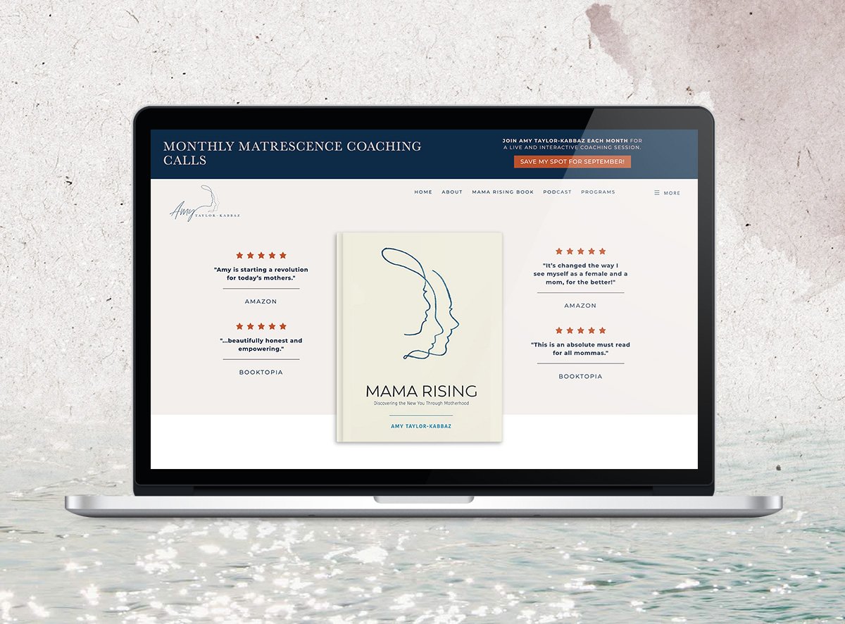
The book page of one of our favourite clients, Amy Taylor-Kabbaz, is one close to our hearts. Her ground-breaking book, Mama Rising, is loved by thousands of mamas around the world for its powerful message.
We wanted to highlight that powerful message with her author website. Equally important was how Amy’s audience has responded to it. We placed the book in the centre and encircled it with glowing testimonials and star ratings.
Amy’s typography mixes the classic serif Baskerville with the clean sans-serif Montserrat for a clean professional vibe. The colour palette of muted marine blue and soft pink create an inviting feminine vibe, consistent with the branding across her personal website.
What you should steal: To build trust in your expertise, make sure your brand is striking the same note across all your online platforms. Think of it like maintaining the same voice across different conversations. People will feel more connected and comfortable interacting with you (and buying from you) if you’re consistent.
4. Brené Brown
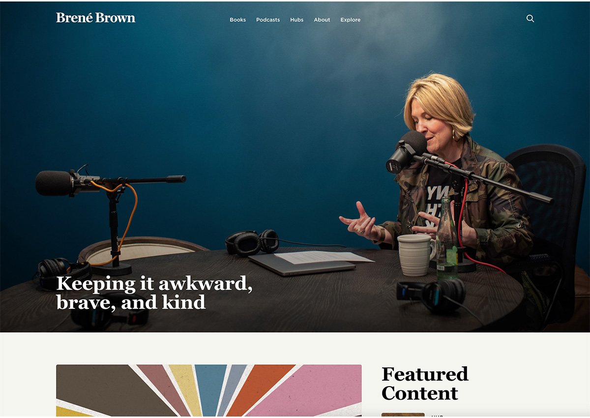
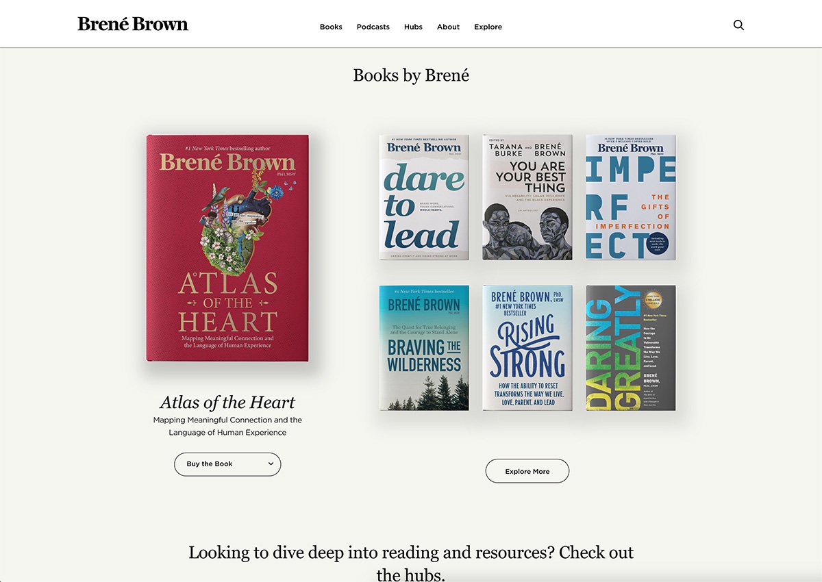
Brené Brown is a renowned researcher, bestselling author, and speaker known for her expertise in the fields of vulnerability, courage, shame, and empathy. Just as you’d expect from this influential woman, her author website is simple and beautifully crafted.
From a branding perspective, Brené opts for a subtle and minimalist colour palette featuring clean black, cream, white, and warm blue. The simplicity of this colour scheme allows visitors to focus on the website copy, fostering a sense of calm and clarity that mirrors the insightful nature of Brown's work.
Brené’s website is meticulously organised, with a clean user experience and separate promotion pages dedicated to each of her books. This careful segmentation allows visitors to explore her books based on their theme.
One of the standout features of Brené Brown’s website is the thoughtful inclusion of organic textures, such as wood and stone, as backdrops. This textural choice adds a grounded, calming feel to the overall aesthetic, aligning perfectly with the authenticity and warmth of her writing.
Brené’s choice of Georgia for headings and Gotham fonts as the supporting body text ensures the text is always readable, while adding a touch of elegance and sophistication to the overall presentation.
What you should steal: Not sure what your author brand should look like visually? Consider how you can make your brand match the experience readers will have when they read your work.
5. Dr Kristy Goodwin
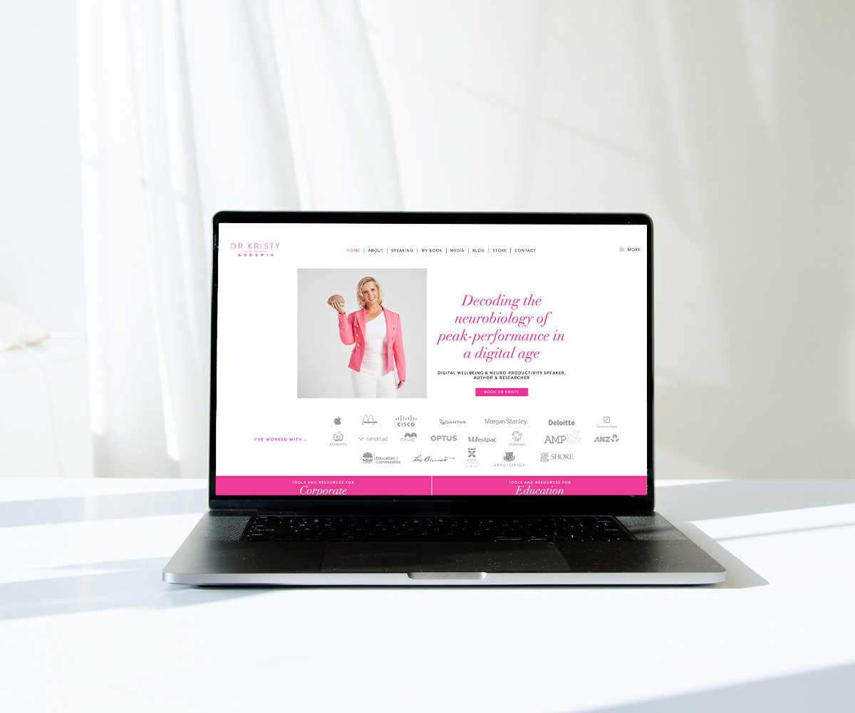
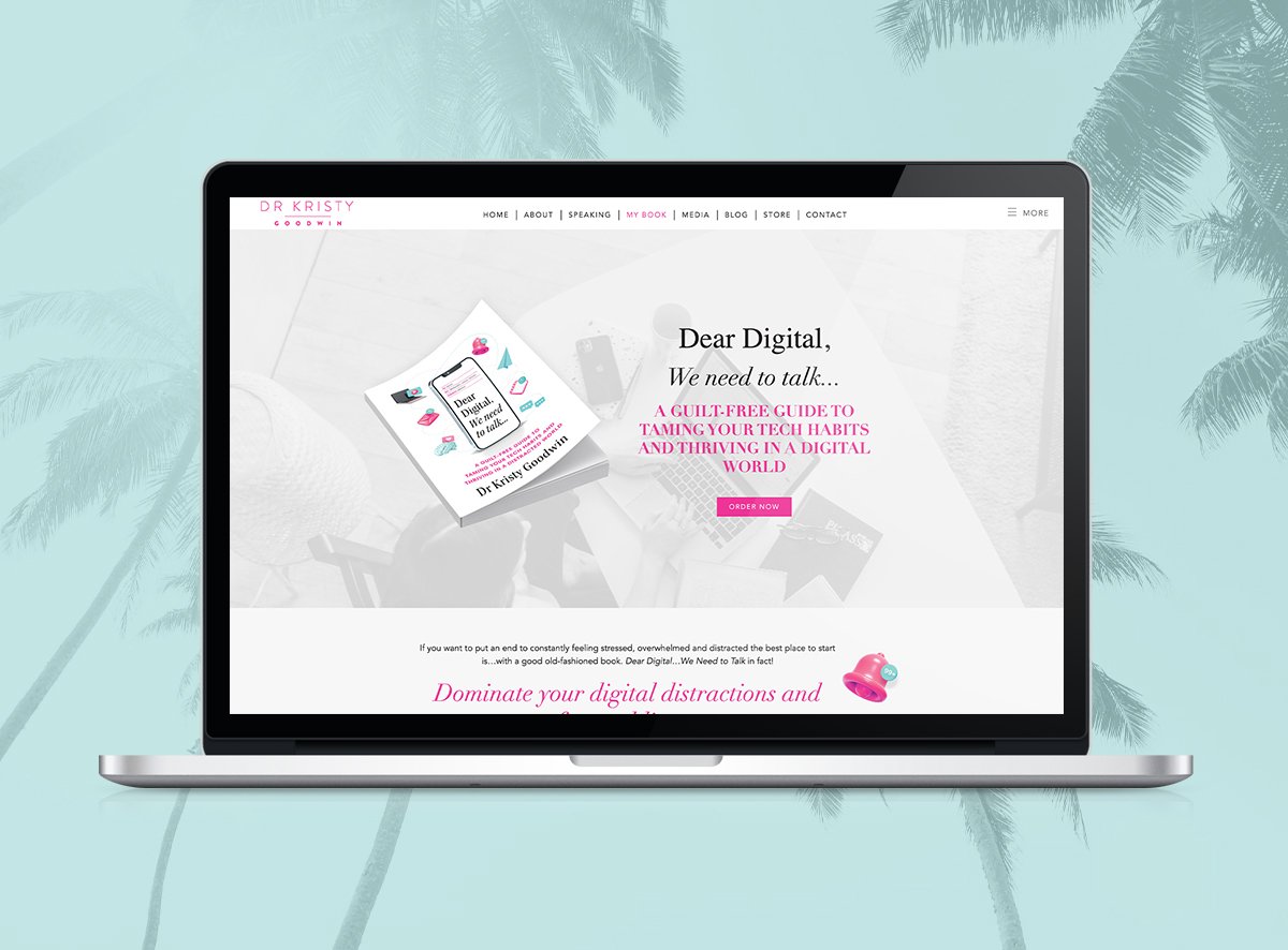
A renowned Australian author, speaker and media commentator, Dr. Kristy Goodwin is on a mission to help people make informed choices about their digital habits, based on the latest neuroscience, developmental science, organisational psychology and technology research.
Visitors to her website are greeted by a vibrant colour palette of hot pink, accented with turquoise and soft pink, clean white and black. This visually striking combination creates a polished, modern feel, reinforced by the bubble-shaped icons and clean professional fonts like the elegant DidotLTStd-Italic for headings and readable Brandon Text as body text. The bold pink call to action buttons guide the visitor to take action with clear action steps.
What you should steal: Social proof is everything. If your book is getting rave reviews from readers, put what they’re saying front-and-centre to entice your future readers to buy.
6. Hannah Austin
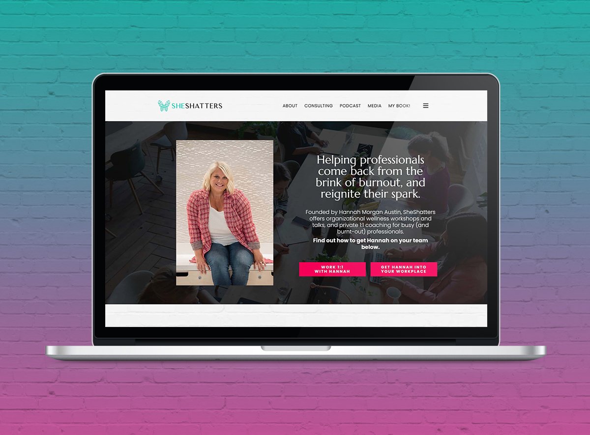
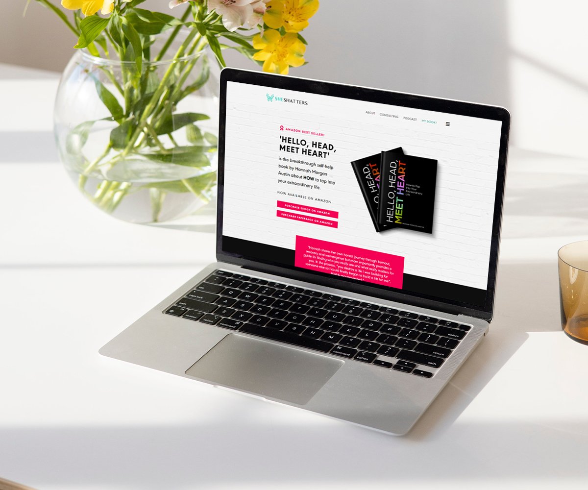
Hannah Austin of SheShatters is an organisational wellness consultant, creator of the She Burns podcast, and the Amazon bestselling author of the book, ‘Hello, Head, Meet Heart’.
Just like Hannah herself, her website and book page (designed by us) are vibrant,friendly and professional. The colour palette is simple but bold. Think dashes of vibrant red, bright turquoise and hot pink, with white and black to anchor them. The brand uses the geometric sans serif typeface, Poppins, to create a playful yet professional vibe.
Her website leverages not one, but four examples of social proof. From the reader testimonials about her book showcased in bold red, to the pink ‘What readers are saying’ box, hot pink carousel testimonials, and logos from businesses Hannah has worked with, Hannah’s book page is brimming with credibility.
She includes a video on the page, where she talks directly to her target reader. Her ‘Who is it for’ section calls out her target audience’s challenges and hopes, inviting them to decide if the book is right for them.
What you should steal: If you can, include a video to build a personal connection with the people visiting your book page. This doesn’t need to be overwhelming. It can be as simple as recording yourself welcoming them to the page and a brief summary of what you hope they’ll gain from the experience of reading your book.
7. Glennon Doyle
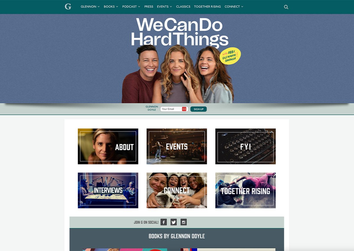
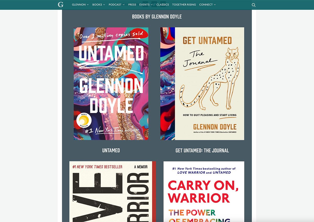
Glennon Doyle is an author, activist, founder of Together Rising, and host of the We Can Do Hard Things podcast.
She’s written so many books - Untamed, the Get Untamed journal, Love Warrior, and Carry On, Warrior - that each one actually has its own website with its own unique colour palette and typography to match the typography and cover of the book. Her vulnerable, human photography and typography (with headings in the B style Komu font), are the throughlines creating cohesion across each book page.
What you should steal: If you’ve written several books, each with a distinct personality, you can of course create multiple websites. You do you. Just make sure there’s a strong throughline uniting your brand across each website.
8. Maggie Stiefvater
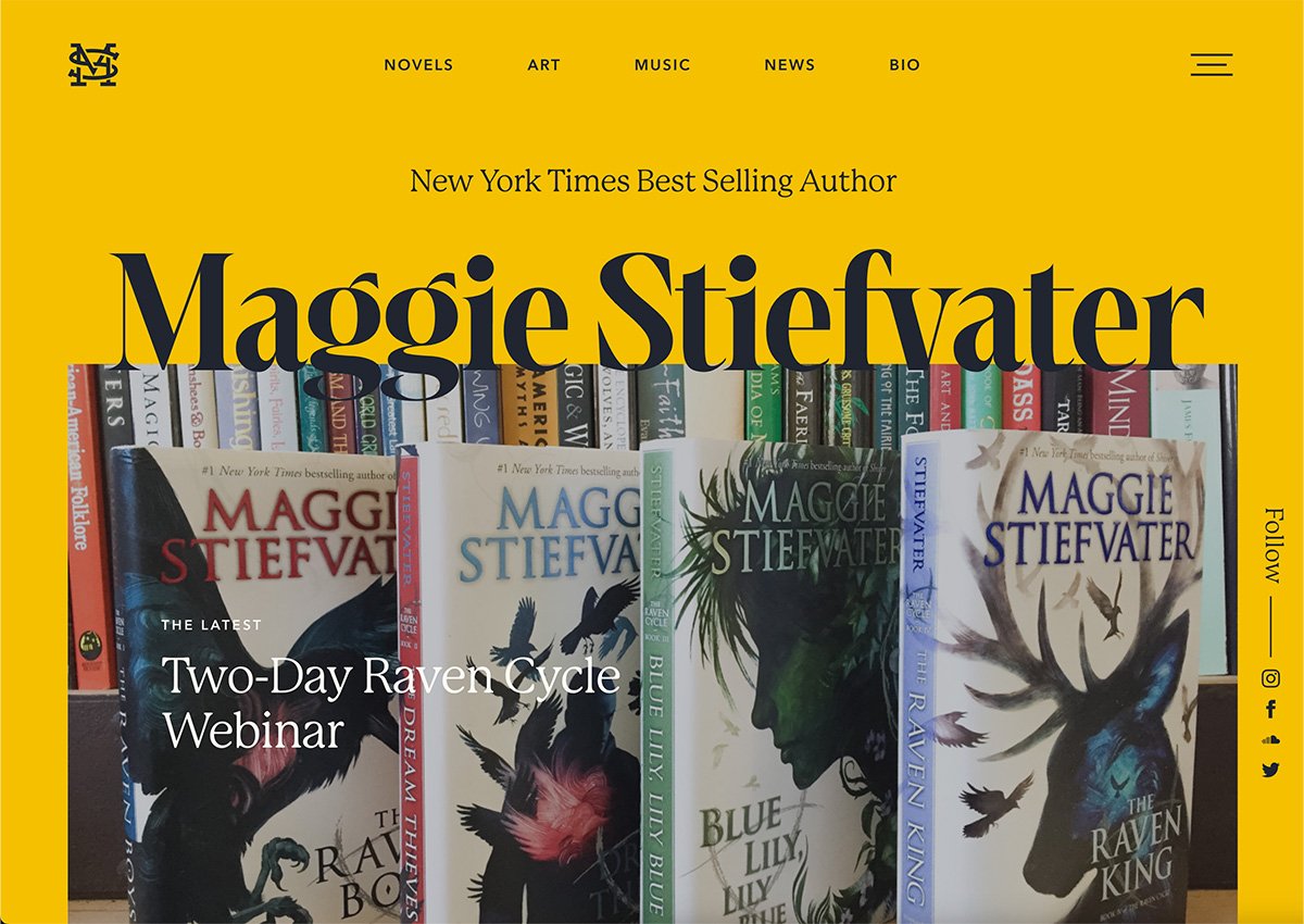
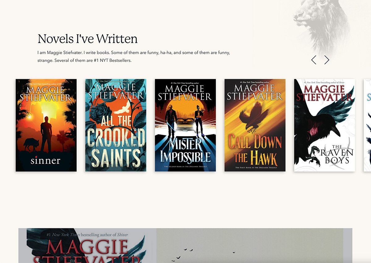
#1 New York Times Bestseller author of the Raven Cycle, Maggie Stiefvater is the first fiction author on this list.
For this website, mood is everything. As an author of magical realism books for young adults, Maggie’s photography is dark and mysterious to match the tone of her books. Her author website uses contrasting typography and colours to grab attention - with the condensed and high contrast serif font exlibris in white contrasting against the bold yellow background and the light and airy geometric sans-serif typeface Avenir.
Actions are signposted to make navigating the website easy. The interactive yellow highlight on the clickable text guide the user to the next action step, while the yellow and black CTA buttons with a purple hover make buying simple with a few quick clicks.
What you should steal: If you can, invest in branded photography that matches your planned website aesthetic. Using original photography is always better than dipping into the cringey world of bland and basic stock photos.
Investing in your author website is investing in your reputation
A polished website is the best way to establish your credibility as an author. But your website is so much more than just a digital platform that allows people to buy your book. It’s a strategic extension of your author brand as a whole.
The question is: How do you want to show up? Are you a minimalist like Esther, or is Kristy Goodwin’s vibrancy more your style? Do you want to stand out like Maggie Stiefvater, or win hearts and minds with social proof like Hannah Austin?
If you’re looking for a starting point for your author brand, you’ll definitely want to check out our Brand Archetype quiz.
As experts in website design for authors, we’ll help you unearth your authentic aesthetic. Take the quiz now to discover your brand archetype and create the right strategic foundation, so your future website can rank among the best book author websites.
Take our quiz now to discover your brand archetype so you can build the right strategic foundation for your online presence.
