Best Author Website Design | 5 Ideas to Inspire You
Writing a book (and promoting it right) can come with lots of cool benefits. Like having your industry know your name and listening to what you have to say.
More referrals sliding your way.
Podcast interviews, speaking and PR opportunities scrambling to book you, instead of the other way around.
When you have a book, you have a viewpoint. And that’s a VERY powerful thing.
But - if we’re honest - we know quite a few business owners and authors who don’t know how to turn their expertise and the glorious, 281-page book they’ve written into what we call an ‘opportunity maximiser’.
What makes an author website good? We think it comes down to how it positions you to attract the best opportunities.
Here’s our advice for the brilliant business owner who’s ready to elevate their authority and book out stages.
The best author websites of 2024 have these things in common
1. A speaker page
WHY YOU NEED A SPEAKER PAGE
If you want to diversify your income by adding workshops or speaking on stages to your calendar this year, a speaker page is the perfect way to establish your cred.
What does a speaker page include, you ask?
To be strategic, we recommend:
Showcasing your topics of expertise
Including testimonials singing your praises that will catch an event organisers’ attention
A bio that will give them confidence that you’re the right fit to speak at their event
EXAMPLES OF STUNNING SPEAKER PAGES
Here’s 3 examples of speaker pages that knock it out of the park - and what we love about them.
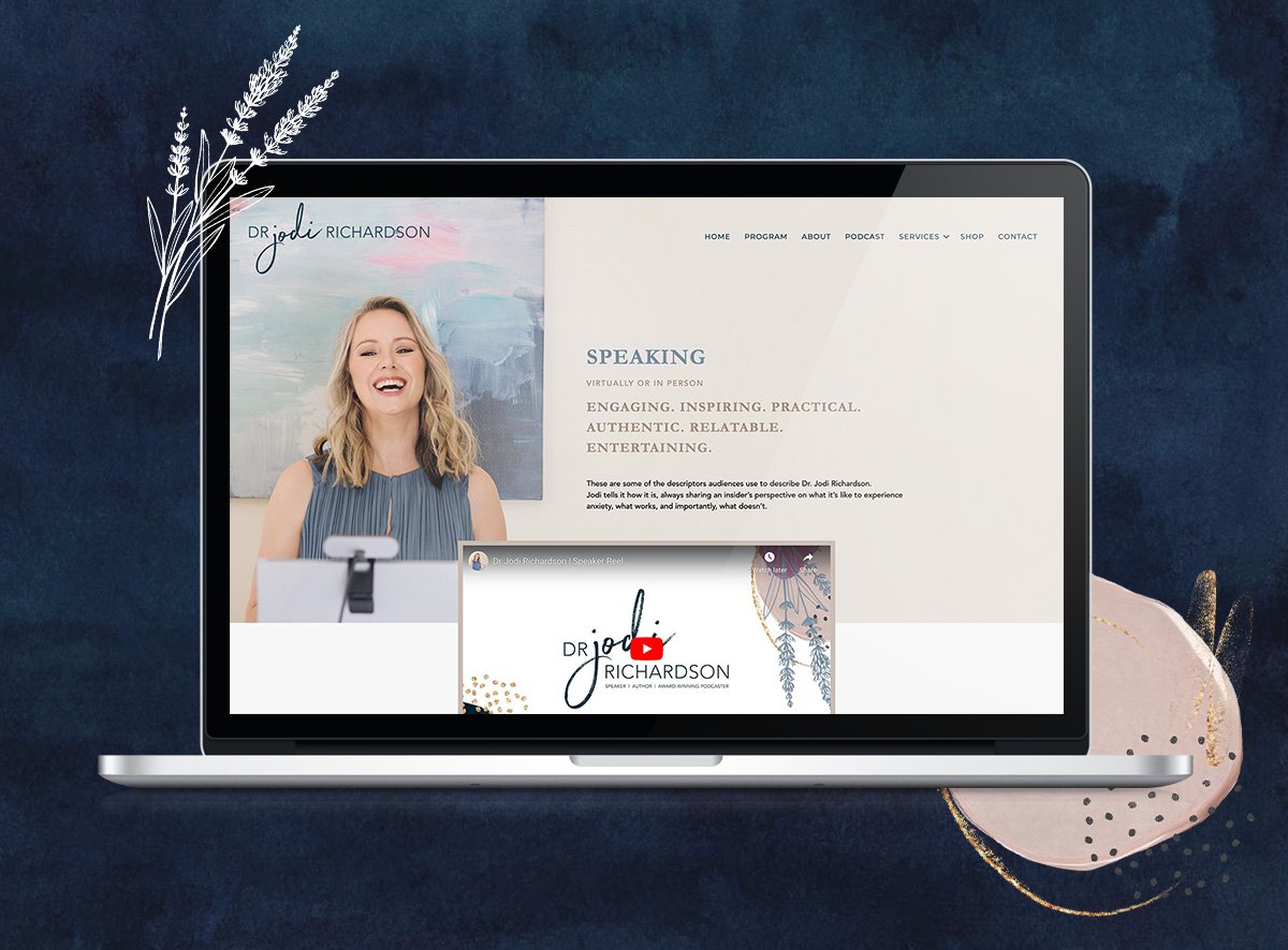
We love that Dr Jodi Richardson’s speaker page includes a stunning video reel and trust-building logos from organisations she has worked with. She shares a range of topics she specialises in, with messages tailored to different audiences.
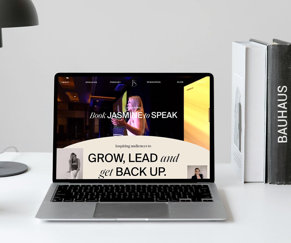
Jasmine Star’s speaker page is bold with stunning typography and a video hero. She has clear keynote topics, a simple booking process, and powerful social proof.
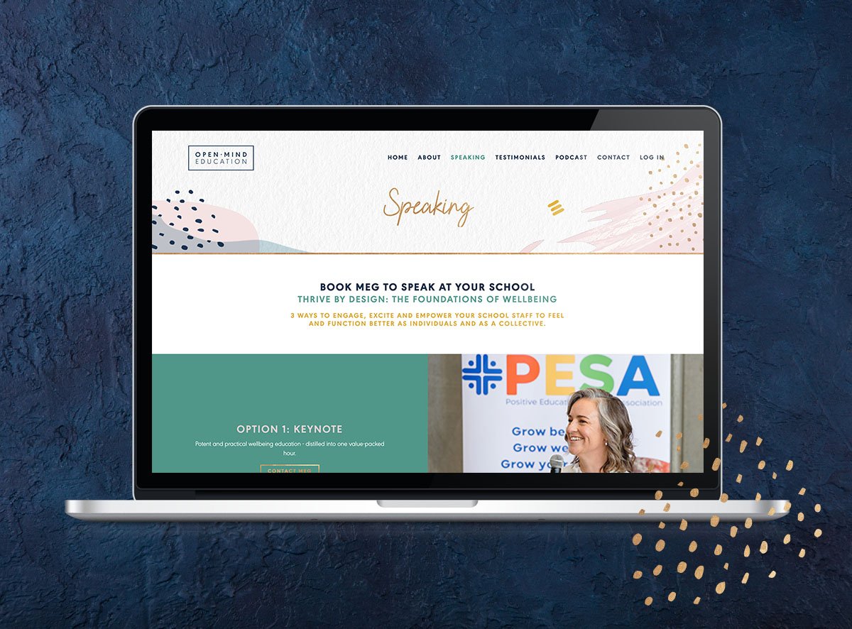
Meg Durham’s speaker page is friendly with a clear niche. Her keynote topics, together with her testimonials, make it clear she knows her stuff.
2. An About page
WHY YOU NEED AN ABOUT PAGE
The About page is a must-have for any author website. Your About page is the place for you to share your unique story and your why as an author.
Your About Page can include any of these creative elements: your history, presented as a visual timeline with photos. Your history, shared as an immersive story with a narrative hook. The story of the influences that inspire your work. A video that acts as a pre-sales platform. Inspiring stories from your community or readers. Reader reviews or social proof to show off your accolades and awards.
EXAMPLES OF AMAZING ABOUT PAGES
Here’s 3 examples of About pages that we swoon over - and ideas you could borrow from them.
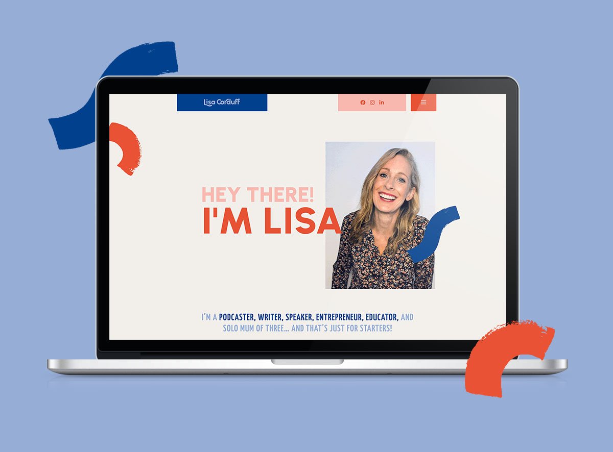
Lisa Corduff’s About Page, with a design created by us, features a fun timeline, changing snapshots of Lisa at different ages, and a Cosmo-style quiz at the end
Alissa Rumsey’s about page includes Alissa’s powerful personal story and belief statements that define her mission and bring her impressive body of work to life.
3. Book pages
WHY YOU NEED A BOOK PAGE
An author website without a book page is… well, not a very good author website. The goal of your book page is to get more people buying your book. To do that, you need an enticing blurb and social proof illustrating that your book is worth their time.
EXAMPLES OF BRILLIANT BOOK PAGES
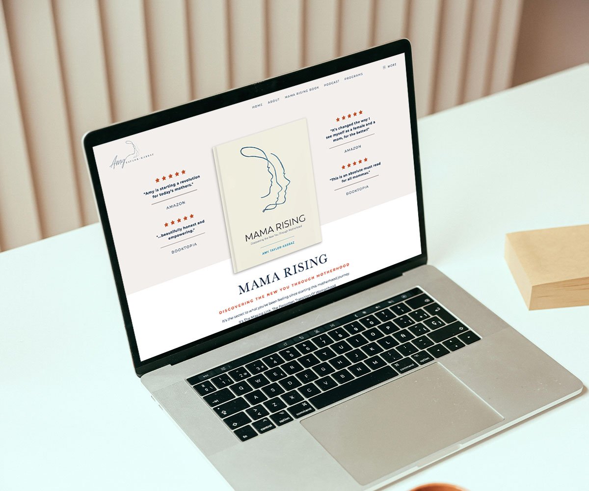
Amy Taylor-Kabbaz’s book page practically glows with overflowing praise from her readers. Putting your readers’ reviews front-and-centre on your book page is always a smart move. Her page also includes a range of links to online stores (broken down by region) to make buying her book easy.
Thanks to her prolific heartfelt writing, Glennon Doyle has a sprawl of book pages across the internet. Each book has its own website with a distinct design that mirrors the book cover. Tip: If there are experts in your industry (particularly one your audience respects), place their reviews for your book prominently on the page, ideally above the fold.
4. A Media page
WHY YOU NEED A MEDIA PAGE
A Media page is like a Speaker’s page, but tailored to journalists. Ideally, it should include a contact form so the media can get in touch with you. A bit of background about you as an author, including your impact, vision, and values. Highlights from well known media coverage. A section to highlight any awards you’ve received. And a link to download your media kit if you have one.
EXAMPLES OF GREAT MEDIA PAGES
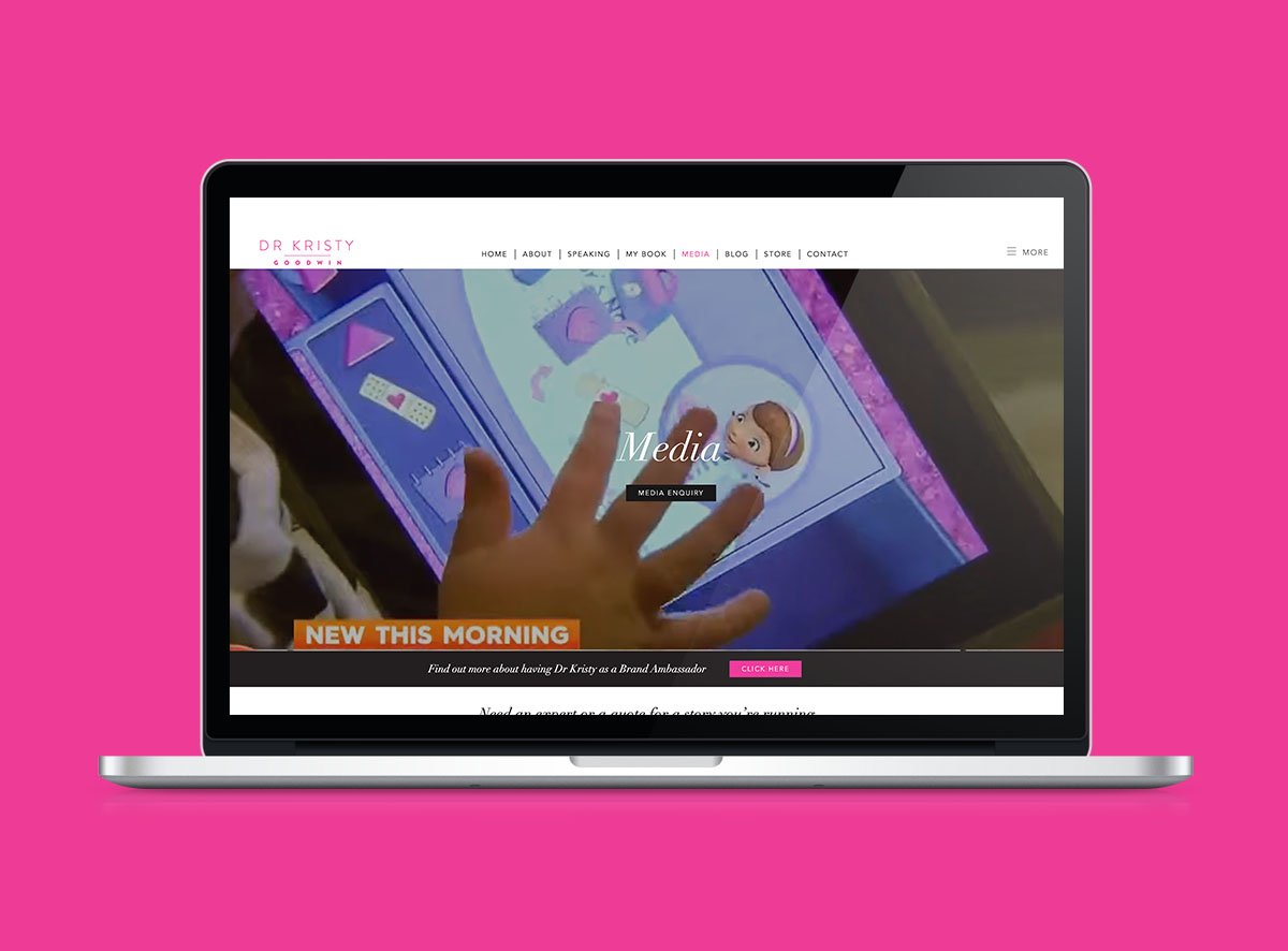
Dr Kristy Goodwin’s Media page earns her credibility by proving her expertise - with lots of videos showing her TV appearances and logos from the media she has featured in. Her contact form includes a simple drop-down, asking whether the person reaching out belongs to a corporate organisation or a school.
5. A Podcast page
WHY YOU NEED A PODCAST PAGE:
Podcasts and books go hand-in-hand, not least of all because hosting a podcast is a natural way to build up a fanbase for your body of work.
EXAMPLES OF FANTASTIC PODCAST PAGES
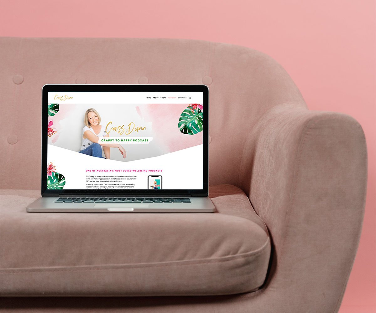
Cass Dunn’s From Crappy to Happy podcast page establishes its credibility right from the start, sharing the number of downloads and awards her podcast has won. She gives the option to stream her latest podcast episodes right on the page. To diversify her income, she includes a section inviting aligned brands to partner with her podcast.
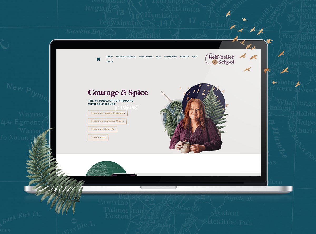
Sas Petherick’s Courage & Spice podcast page features her latest episode plus 3 recent episodes, and invites people to submit topic requests, Agony Aunt-style. At the top of the page, she includes a list of places where you can stream her podcast.
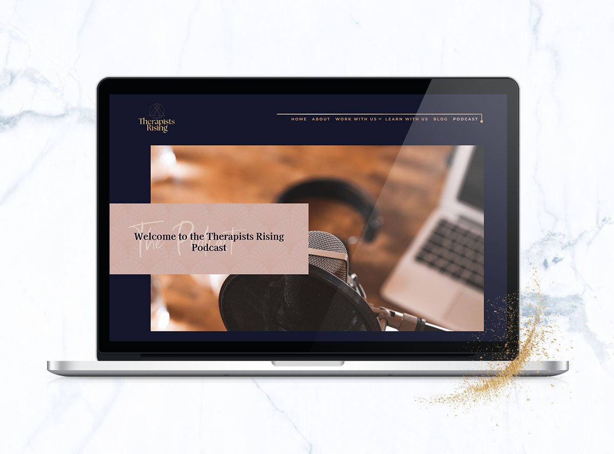
The Therapists Rising podcast page by Hayley Kelly shows that simplicity can be also effective. Hayley includes all her podcast episodes all on one page, with the expert guest’s photo, a compelling episode title and a short blurb. This format is perfect if you want to get your audience to dive right in by clicking on an episode that intrigues them.
Are you ready for a new brand or website that does justice to the full spectrum of your work? Take our quiz now to discover your brand archetype so you can build the right strategic foundation for your brand and website.
Take our quiz now to discover your brand archetype so you can build the right strategic foundation for your online presence.
