Best Business Coach Websites of 2024
If you’ve recently doubled down on your expertise or upgraded your credentials, it might be time to uplevel your website to match.
Hot on the heels of our recent article, Best Author Websites, we’ve decided to serenade our favourite business coach websites - and share some super practical takeaways you can use to level up your coach website.
Here are some of the best coaching websites out there - plus our two-cents on how you can fold some of their magic into your own website experience.
6 Coaching Website Examples to Inspire You
1. Julie Solomon
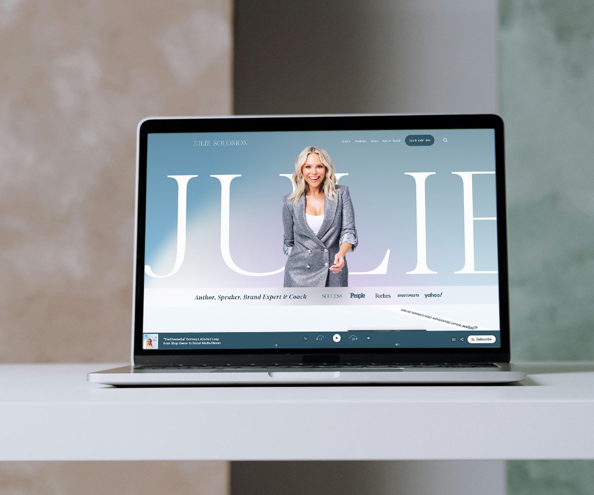
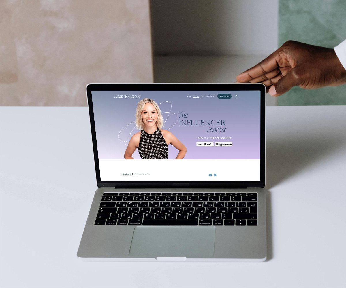
Julie Solomon is a brand and pitch expert, business coach, author and podcast host of the Influencer Podcast who is on a mission to help women expand to their next level of visibility. Her coaching website feels fresh and polished, just like her take on elevating visibility.
If we had to distil Julie’s design aesthetic into one word, that word would be ‘minimalist chic’ (okay, that’s two words). From a visual perspective, Julie’s photography and colour palette of teal, ice blue, pale pink and white strikes the perfect balance between cool Scandinavian chic and inviting warmth.
Layout wise, the website is spacious and airy with a clean user experience. The elevated typography - Ivypresto Display, an Old Style display serif - looks elegant contrasted against the ever-clean geometric simplicity of Montserrat.
What you should steal:
If you have a podcast, you’ll definitely want to swipe the bar that hugs the bottom of the screen on Julie’s homepage. This podcast bar allows you to automatically stream her latest podcast episode.
2. Jasmine Star
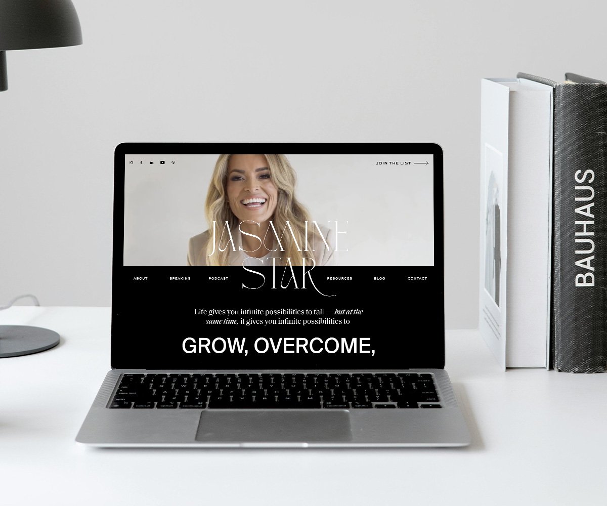
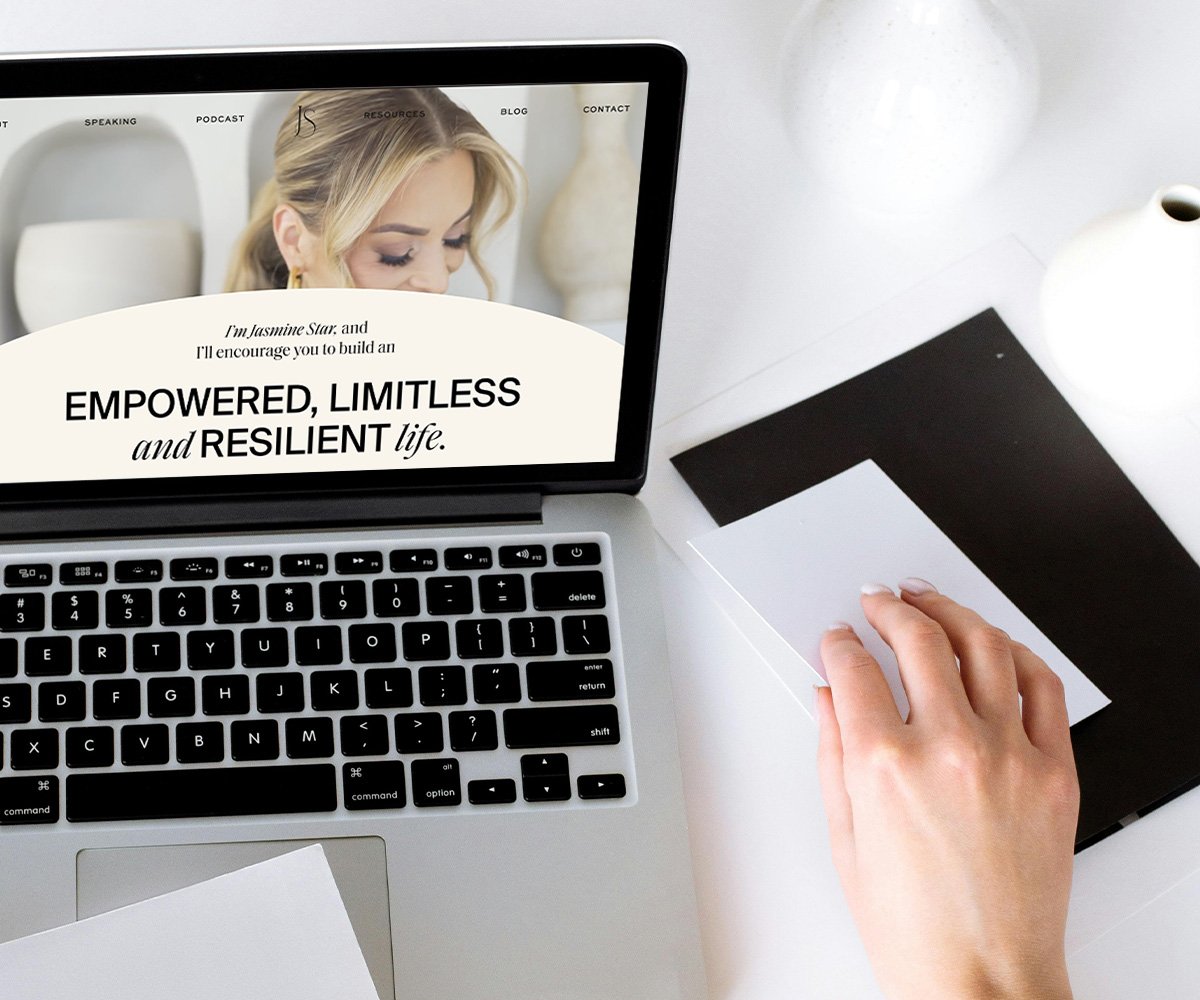
Speaker, podcast host, CEO, and entrepreneur Jasmine Star is bold, dramatic and minimalist with a simple colour palette of black, white and burnt terra brown.
Her designer creatively played with typography to create a distinctive feel and create emphasis. In a single sentence, the bold neo-grotesque sans-serif Suisse Int’l Book contrasts with the italic razor-sharp serifs and high strokes of Saol Display Regular. The body font, Sweet Sans Pro Medium, helps ground this unique pairing.
What you should steal:
We adore Jasmine Star’s hero video on the homepage. Her face laughing and smiling creates instant human connection. Her designer chose to include her nav bar below the hero video. Since video is processed 60,000 times faster by our brains compared to text, this is a smart way to grab instant attention and keep people on her page.
3. Melyssa Griffin
If your vibe as a coach is warm and authentic, you’ll want to take a peek at business coach, online marketer and course creator Melyssa Griffin’s website.
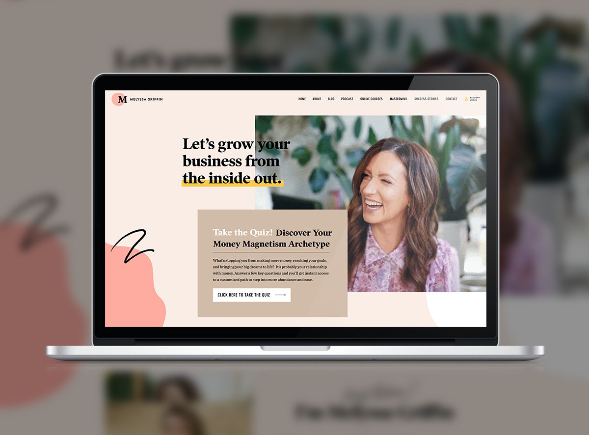
Melyssa’s brand colours are luminous, natural and organic, grounded by her clean typography. The pale peach creates a radiant background with splashes of sunset coral pink, light tan, soft medium blue, and pumpkin orange in organic shapes.
What you should steal:
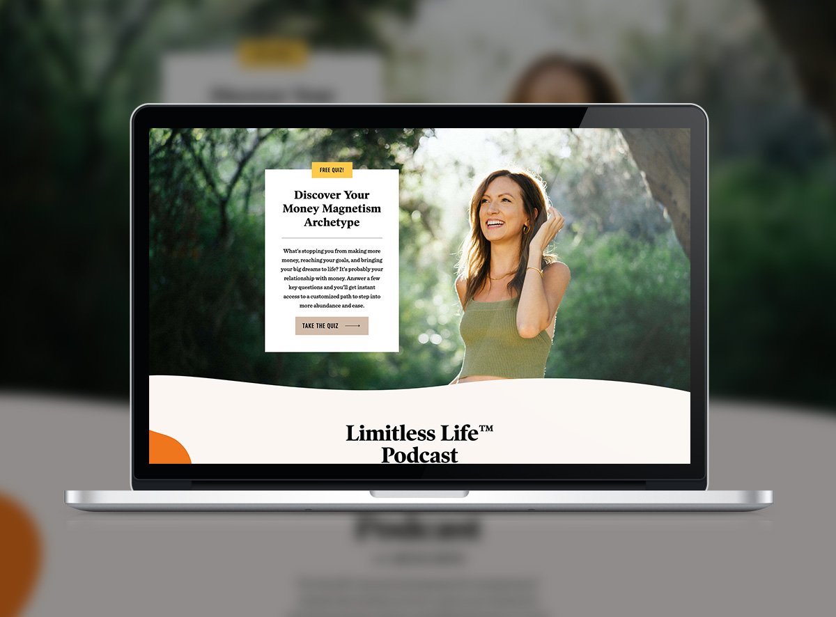
Melyssa Griffin has a killer quiz lead magnet. This quiz, ‘What’s Your Money Magnetism Archetype?’, fuels her email list, strengthens her connection with her audience, and nurtures them to purchase her programs on autopilot.
If you want the lowdown on quizzes and how they can work for coaches, get in touch with us.
4. Megan Dalla-Camina
Megan Dalla-Camina is the author, founder and CEO of women's leadership and empowerment company Women Rising.
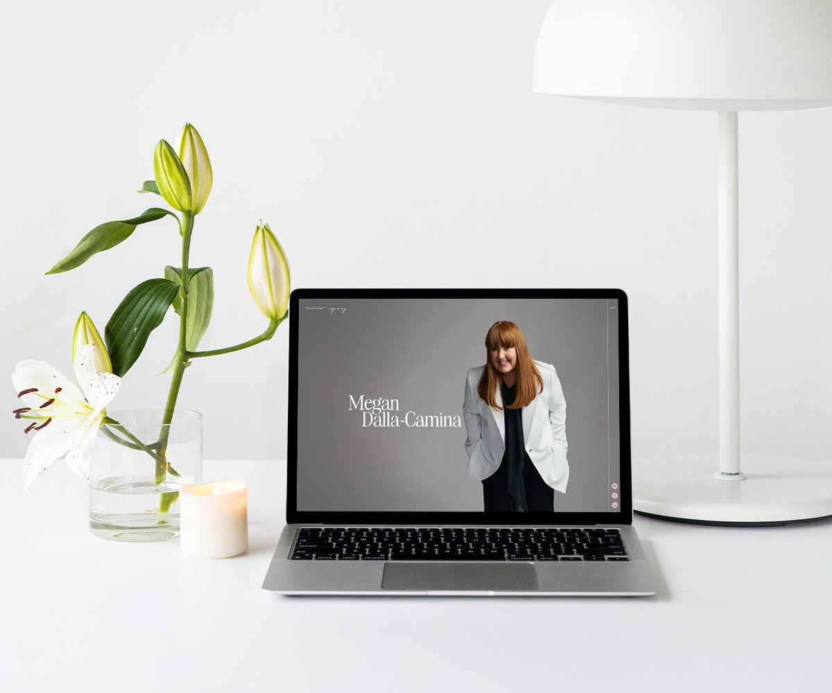
From a branding perspective, Megan opts for a minimalist colour palette featuring soft pink, ivory, white and emerald green, with black and white photography, juxtaposed against colour photography.
Her typography feels spacious and high-end, combining the luxe Very Vogue Display with intimate, handwritten White Oleander Slanted and geometric sans-serif Avenir.
What you should steal:
Megan Dalla-Camina’s photos on her homepage feature a fun subtle hover effect, which makes clicking to her About Page or Books page extra enticing.
5. Emily Osmond
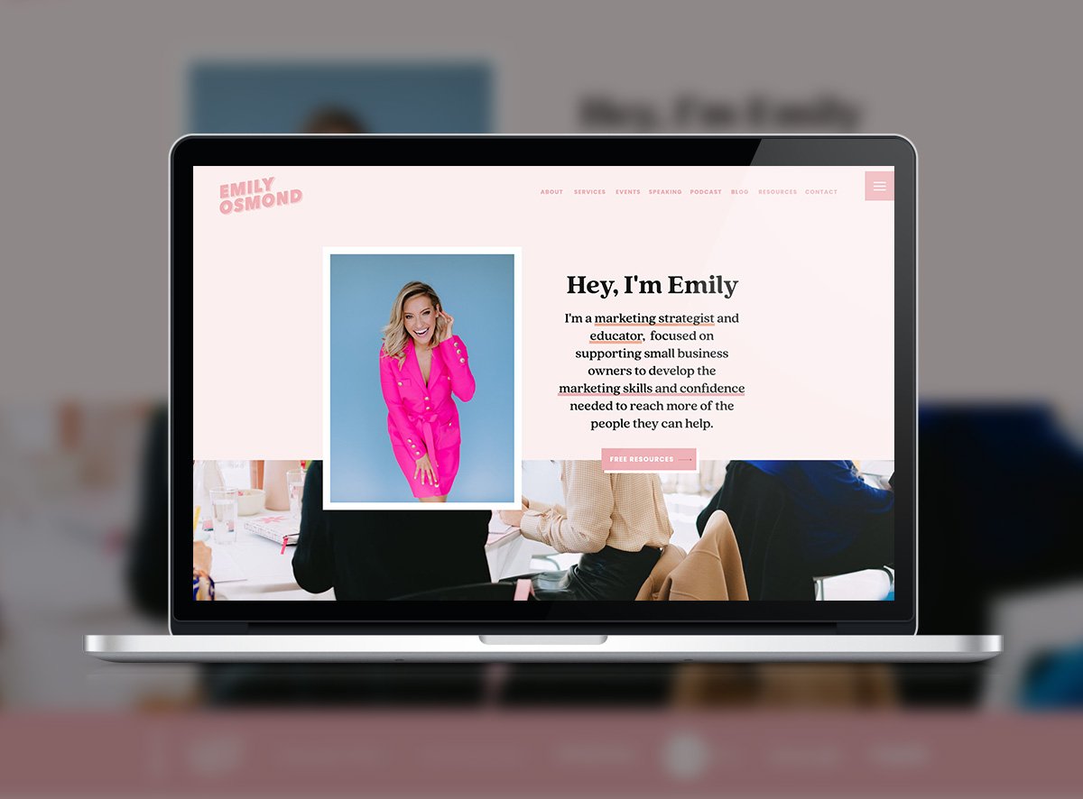
Emily Osmond is a marketing strategist, educator and coach. Her bright yet professional website instantly hits you with a dopamine rush of peach, candy pink, black and white. She uses her font, Quincy CF Extra Bold, a contemporary serif typeface with rounded edges, fluid lines, and high contrast, to grab attention and exude friendly professionalism.
What you should steal:
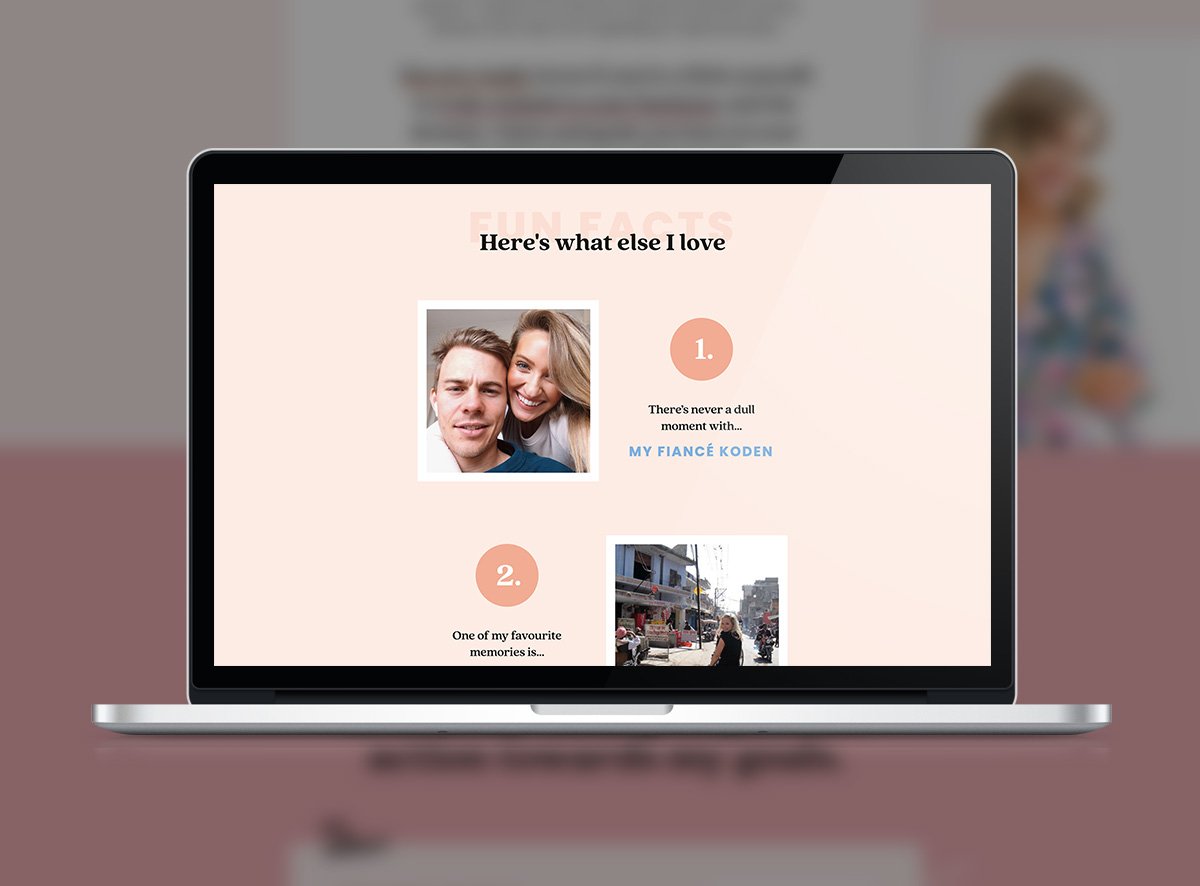
To build a personal connection with her audience, Emily’s visual About page features lots of personal photos, designed to look like polaroids.
6. Celina Souffant
Celina Souffant is a career coach and business strategist who helps individuals, startups and major tech companies achieve their growth goals.
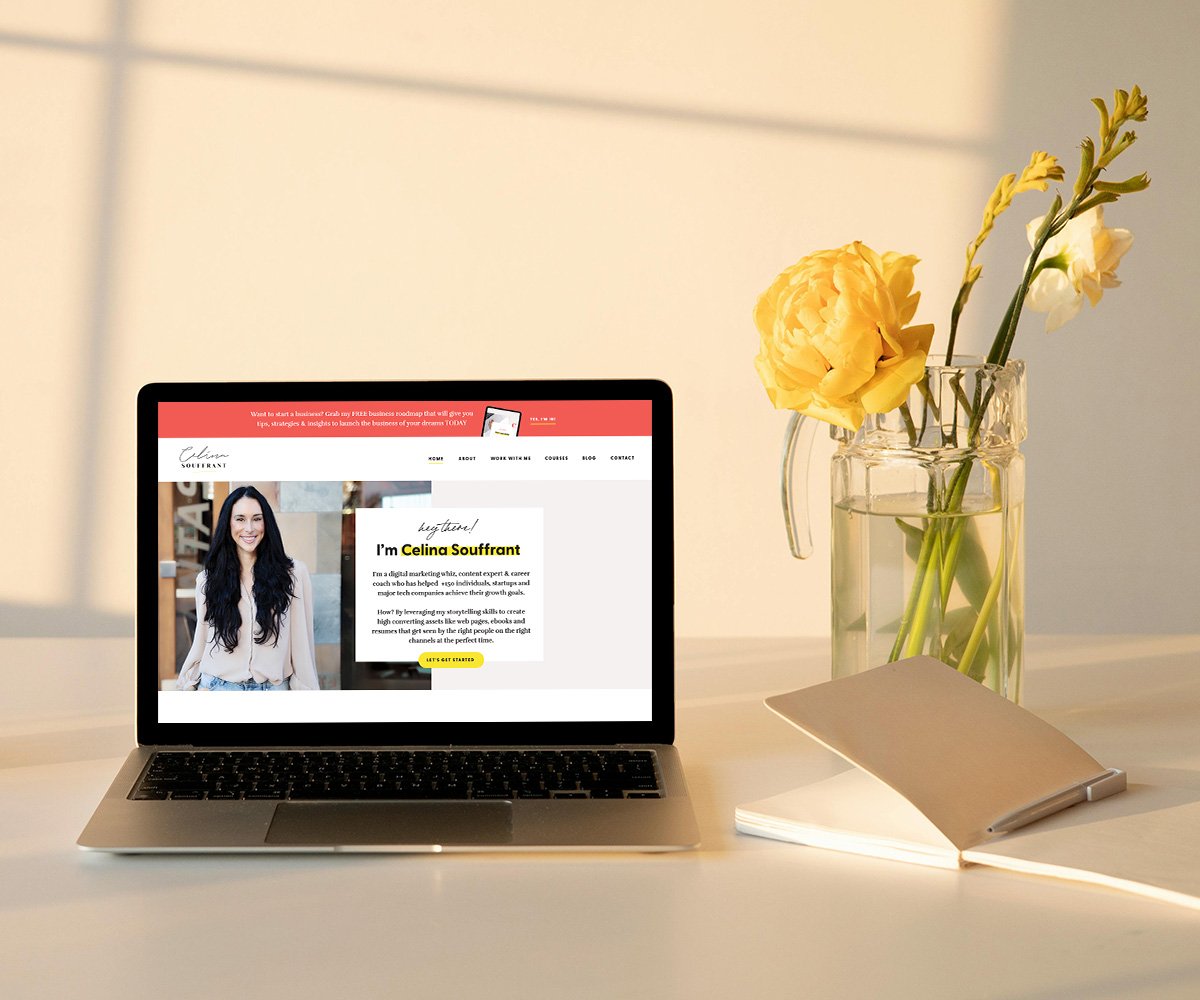
Her website feels modern and techy thanks to the flat lay style icons and punchy yet clean colour palette - perfect for her audience of tech-related businesses. Hot coral red, banana yellow and rosy peach stand out against the clean grey-white background.
What you should steal:
Celina Souffant’s homepage features subtle touches of animation on her icons, which add a fun and playful interactive touch to her straightforward design.
7. Natalie MacNeil
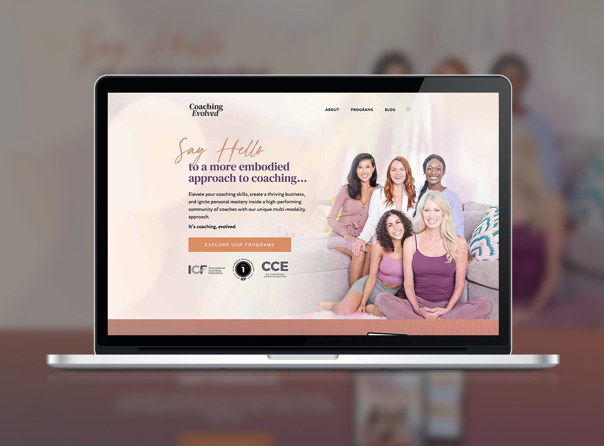
Don’t mind us, we’re playing favourites. Natalie MacNeil is a client of ours and we love how her Coaching Evolved website feels like a warm glow up. The peach, sunset purple and soft ivory are perfectly aligned with her brand, which focuses on helping her coach clients become more confident, masterful and up-level their business. The typography balances high contrast serifs with a human geometric sans-serif and sophisticated handwritten script.
What you should steal:
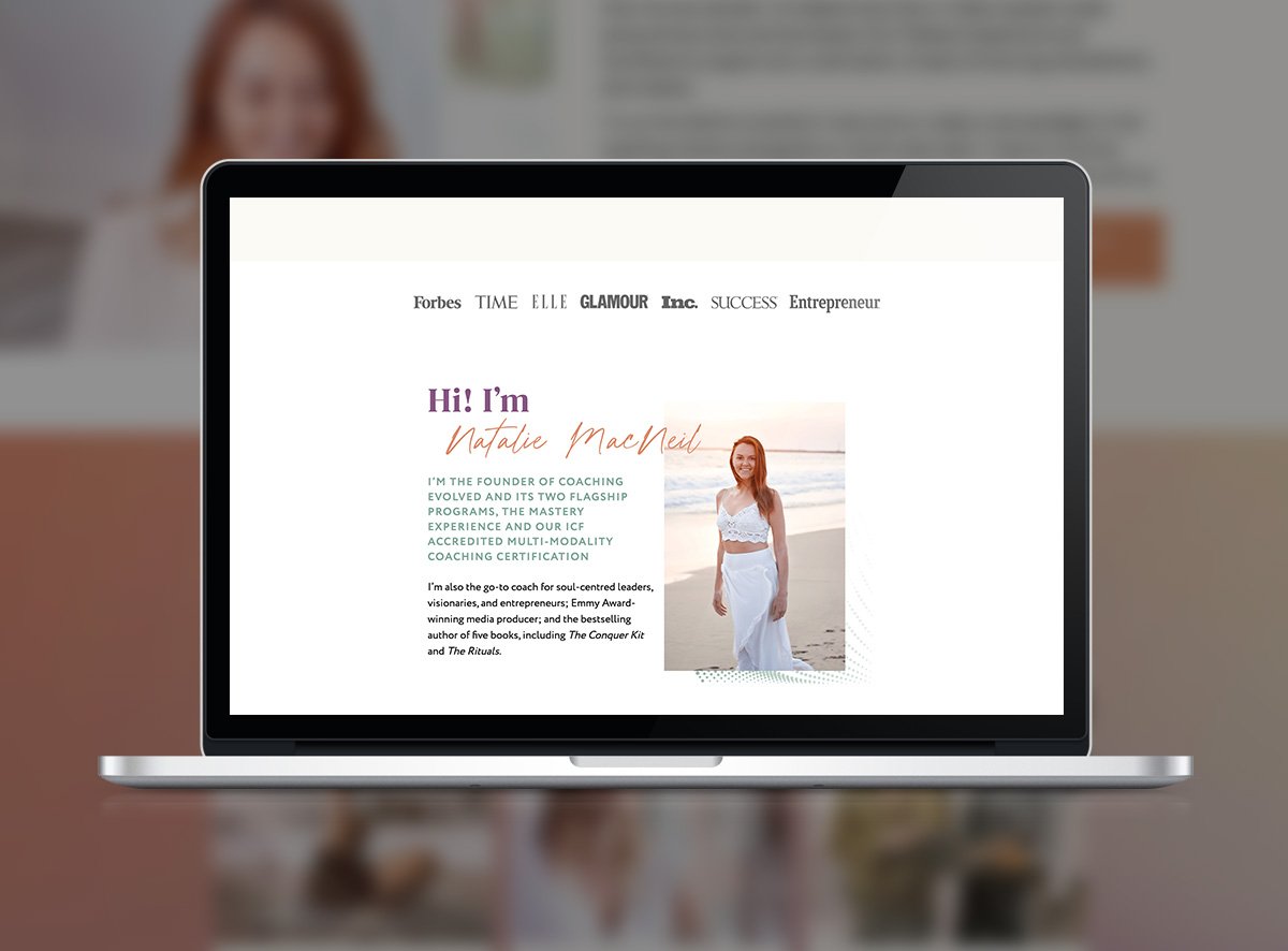
Social proof galore! If you’ve peeped her student testimonials, you’ll know that Natalie MacNeil has an incredible impact on her students’ businesses. To cement her credibility to online visitors who stumble across her website, her homepage is jam-packed with logos testifying to the media she has featured in and the accreditation she’s earned as a ICF-accredited coach.
Is it time to refresh your coaching website?
Ready to refresh your brand identity after a few years in the game? Then you’ll definitely want to check out our Brand Archetype quiz.
As experts in website design for business coaches, we’ll help you curate the aesthetic that feels right for both you and your ideal clients.
Take our quiz now to discover your brand archetype so you can build the right strategic foundation for your online presence.
