10 Author Website Must-Haves | Your Checklist for Success
Pop quiz, dear author.
Is your website:
A) A digital storefront for selling your book
B) A powerful credibility booster that can position you as the go-to expert in your industry and open the door to lucrative speaking opportunities
or C) Both.
If you said C, you’re absolutely right.
This handy checklist will show you how to make your author website your ace-up-your-sleeve marketing tool.
In this article, we'll explore the ten must-haves your author website needs to elevate your authority, grow your book sales, and position you as ready for lucrative speaking opportunities. Let's go!
What makes a good website? A Checklist
1. Bold branding
Does your website pass the 3 second test? Grabbing your reader’s attention in those first crucial seconds is all about branding, baby.
Not sure where to start with your author brand? Here’s where to start.
Define your target audience
Ask yourself:
Who is your primary and secondary target audience? Decide who you want to prioritise most. Yep, the buyer and final reader of your book is probably at the top. But don’t forget about publishers, booksellers, book stockists, event organisers, and people who will hire you for speaking engagements. Rank each of these audiences from 1 to 5, and use that as a guideline for your copy and what pages you include on your website.
Who will be visiting this page? (Ask that for each page). What journey did they take to get here? And what will their journey be through the website?
What do each of these audiences want? And how can you give them that?
Clarify your author brand and unique selling point
Define your brand’s personality. Is it formal or informal, serious or playful? Align your voice with the persona you want to project.
Pinpoint your unique selling point, that captivating element that sets your books apart on the shelf. Why should people choose you? What’s distinct and memorable about your work?
Share your author brand story
Your brand story is ultimately what will make people pay attention and feel connected with you. Think about your personal story, experiences and perspective - you want to use these raw materials to create a clear and compelling brand story.
Your readers are likely curious about you as a person. Let your brand voice reflect your authenticity, and readers will be more likely to connect with you.
People entrusting you with professional opportunities (like speaking engagements, workshop speaking opportunities, or partnerships) will want to know your background and why you’re credible, so make sure your brand story puts a spotlight on that.
Develop your brand’s tone of voice
Understand your target audience's preferences, interests, and communication style. Tailor your brand voice to resonate with them.
Let your brand voice align with your natural writing style. If your books have a certain tone or style, try to incorporate that into your overall brand voice.
Your brand’s voice might be gentle and laidback or it might be bold, bubbly and playful. But to earn your audience’s trust, it should always be consistent.
2. Intuitive User Experience
Your book (and readers) deserve a website with an intuitive user experience.
After all, a poor user experience can make people hit the back button instead of the buy button.
Make it easy for users to navigate your site by placing simple menus in strategic locations. The copy on your website should be helpful, clear, and human-centered to help people complete core tasks like checkout on the site.
3. A Compelling Homepage
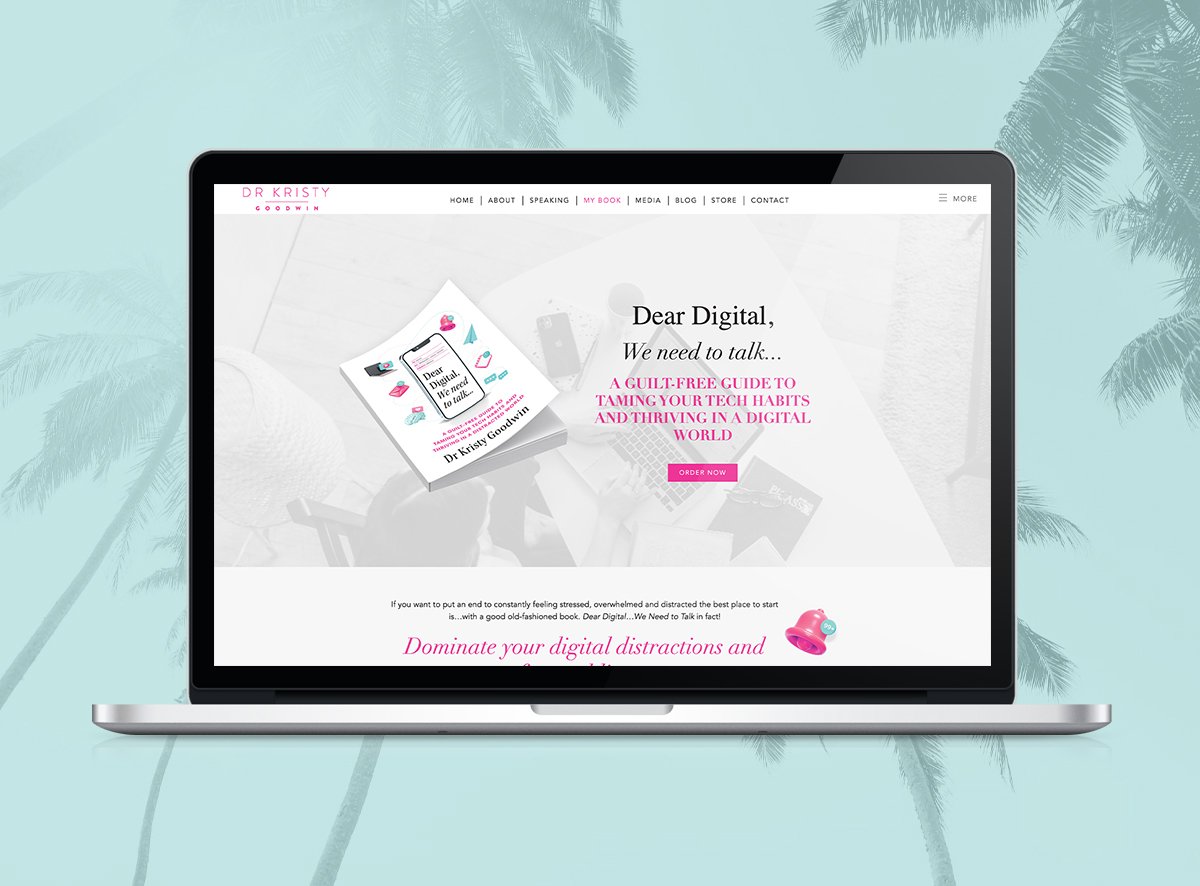
Your homepage should create a beautiful, creative online representation of you as an author. And it should clearly state your niche and the audience you’re writing for.
Don’t assume your body of work is for everyone. Keep it simple and choose just one or two ideal audiences. This will help your messaging land much stronger.
Include a clear call to action with the next ideal step your website visitor should take. Depending on your goals, this could be buying your book, joining your email list, or hiring you as a speaker.
Don’t offer too many options. Pick the call to action that aligns with your goals and strategy.
If you have any upcoming releases or books available for pre-order, it’s a good idea to add a banner with this info to your homepage.
4. A Sales-Ready Book Page
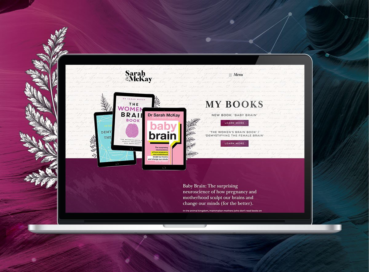
Your Book Page is where you entice people to read your books. Think of it like a mini sales page for your book.
We recommend having one page for each of your books because it allows you to double down on your persuasion with plenty of room for your book cover, reader reviews, and an enticing book blurb.
Don’t forget to give your reader a friction-free way to purchase. Make it easy to find the buy button!
For example, you could include links to everywhere readers can purchase your books (like Amazon, Booktopia or your local booksellers). Or you could build an e-commerce bookshop right into your website.
While it’s tempting to keep things simple with just a few retailer links on your site, keep in mind that retailers are likely to check out your website before your book goes on sale. Be sure to link to all major retailers, plus any specialty retailers you know will carry your book, because this may encourage them to carry more inventory of your title.
If you’ve won any awards, mention them here, as well as the release date for any upcoming releases.
This is also the perfect page to add a chapter preview of your book - with an invite to join your email list, of course.
5. Social Proof Galore
Be strategic with your social proof.
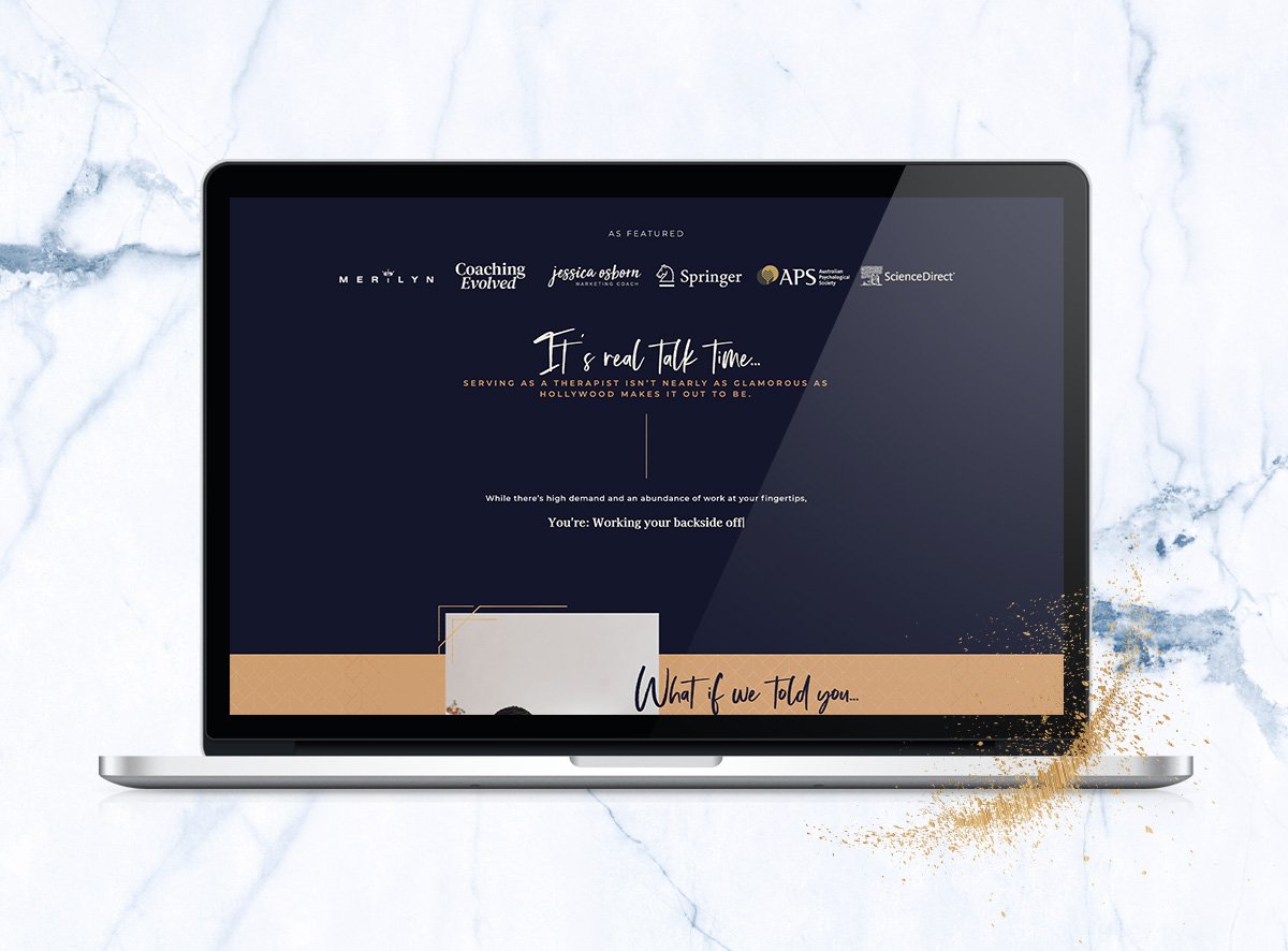
If you have social proof (think awards or glowing book reviews), display them prominently across your site - on your book page, your homepage, your about page, and your contact page, and most importantly, anywhere where you’re asking your website visitor to make a decision or take an action.
6. An Authority-Building Speaker’s Page
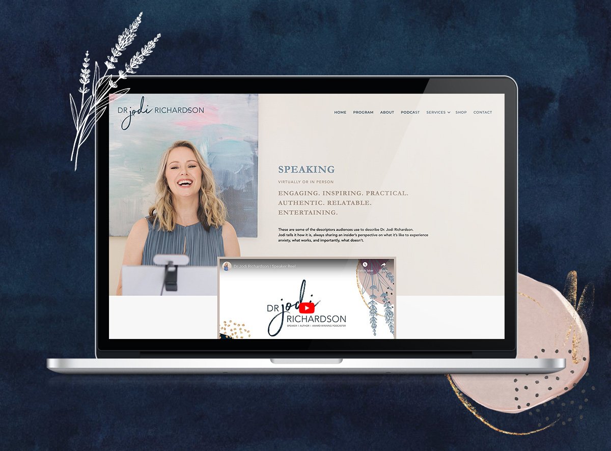
Want to create another revenue stream with speaking opportunities? Make the hiring process simple and convenient for event organisers with a speaker’s page. A speaker’s page should catch attention and persuade visitors that you’re worth hiring to speak.
Does your speaker page answer two essential questions: ‘Why should I hire you?’ and ‘What topics do you speak about?’
Can you include different bio variations so that a journalist or event organiser can easily swipe what they need?
Do you want to include a speaker reel to demonstrate your skills?
Remember to keep your speaker’s page consistent with the rest of your website, branding-wise. Bonus points if your brand reflects the personality and tone of your public persona, books and speaking style.
7. An Enticing Invite to Join Your Email List
If you don’t have a strategy in place to capture leads (such as a lead magnet or newsletter sign up box), chances are you’re missing out on a valuable opportunity to build relationships with your potential readers.
You’ve got two options to nurture your audience:
Add a simple subscription form that invites people to sign up for your mailing list
Create an enticing lead magnet such as a quiz or free download
Either way, you’ll want to send your readers semi-regular email updates.
If you want to go the low-maintenance way, you can set up your tech to automatically send an email to your list every time you publish a new blog post.
But if your main goal is to build a stronger connection with your audience, we recommend investing in a custom email campaign so your readers can get to know you.
For example, you could share a little about you and your expertise, helpful advice for your audience, excerpts from your completed and published books, and book blurbs from your upcoming books.
8. A Compelling About Page
Your About page is an opportunity to showcase your personality and let your readers get to know you. Although this page is technically all ‘about you’, it’s always a good idea to keep your audience front-and-centre.
Ask yourself:
What would they want to know about you?
How can you share your authentic personality?
How can you let them into your world?
Is your brand story both compelling and consistent with your bigger brand?
Your About page is the perfect place to experiment. For example, you could create a fun visual timeline of your life and work.
9. An Irresistible Contact Page
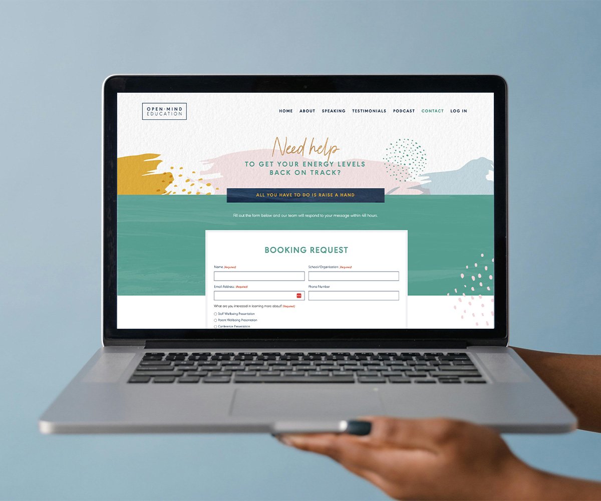
Your Contact page is one of the most crucial pages on your website. Ideally, you want it to invite your fans and event organisers to reach out - yet designed to keep spam out.
At its most basic, all you need is a simple drop down that asks for someone’s name, email address and message with a CAPTCHA.
But you can also invite them to follow you on social media, ask them to preselect what they’re contacting you about (for example, ‘Speaking Opportunities’ vs ‘Ask A Question’), and of course, invite them to join your email list.
If your brand is more playful, try making your contact page personality-driven with fun micro copy or dropdown options in your brand voice.
10. A Trust-Building Video
This one’s totally optional, but if you want to take your professional image to the next level, a polished video might be the way to go.
You could share footage of you speaking at an event, welcome people to your website and books, answer fan’s questions, or even show a sneak peek of an upcoming release. Include this video on your Book Page, your About Page or your homepage.
“You’ve convinced me I need an author’s website. What next?”
The prospect of designing your website from scratch can be overwhelming, but the good news is that you don’t have to.
As experts in websites for authors, we’ll help you uncover your authentic author brand and design for you a beautiful, strategic website that boosts your credibility as an author and speaker.
Take our quiz now to discover your brand archetype so you can build the right strategic foundation for your future author website.
Take our quiz now to discover your brand archetype so you can build the right strategic foundation for your online presence.
