The Irresistible Author Homepage | What Makes A Great Website Homepage?
“Ellissa, how do I create the perfect first impression when someone visits my website’s homepage?”
AN EXCELLENT QUESTION, FRIEND. Let's talk about it.
The moment your ideal audience hits your homepage and decides to either scroll down or leave in just 3.121 seconds? That’s the moment you’ve got to grab their attention and not let go.
But equally important is the entire homepage experience. Questions like:
How will you entice them to click and dig deeper into your website?
How will you make your copy and visuals so sticky that they’re excited to learn about you and your work?
How do you get them to sign up to be the first to know when your new book, program, service or coaching offer drops?
In this article, we’re gonna keep it simple by asking the question, ‘What makes a great website homepage?’ But we’ll dig into all of the above, I promise.
If you missed our earlier advice on the 10 must-have ingredients of an author website, do future you a favour and scoop up that handy checklist now.
All set? Let’s go.
What makes a great website homepage design?
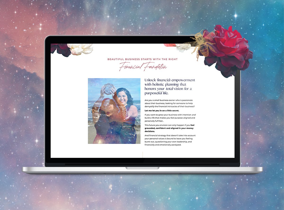
Your hero section (ain’t nothin’ without an irresistible value prop)
Is your headline clear, simple and persuasive? The kind that gets your audience excited to read your work in 8 words or less?
Sure, you could just open with your pen name. And that’s a great start.
But if you want to make a more memorable impression, we recommend leaning into what makes your work unique.
Your hero section needs to have a story hook.
Think: What’s the core theme and promise of your brand?
After landing on your homepage, your audience should have an inkling that your work could be their next 5-star review on Goodreads.
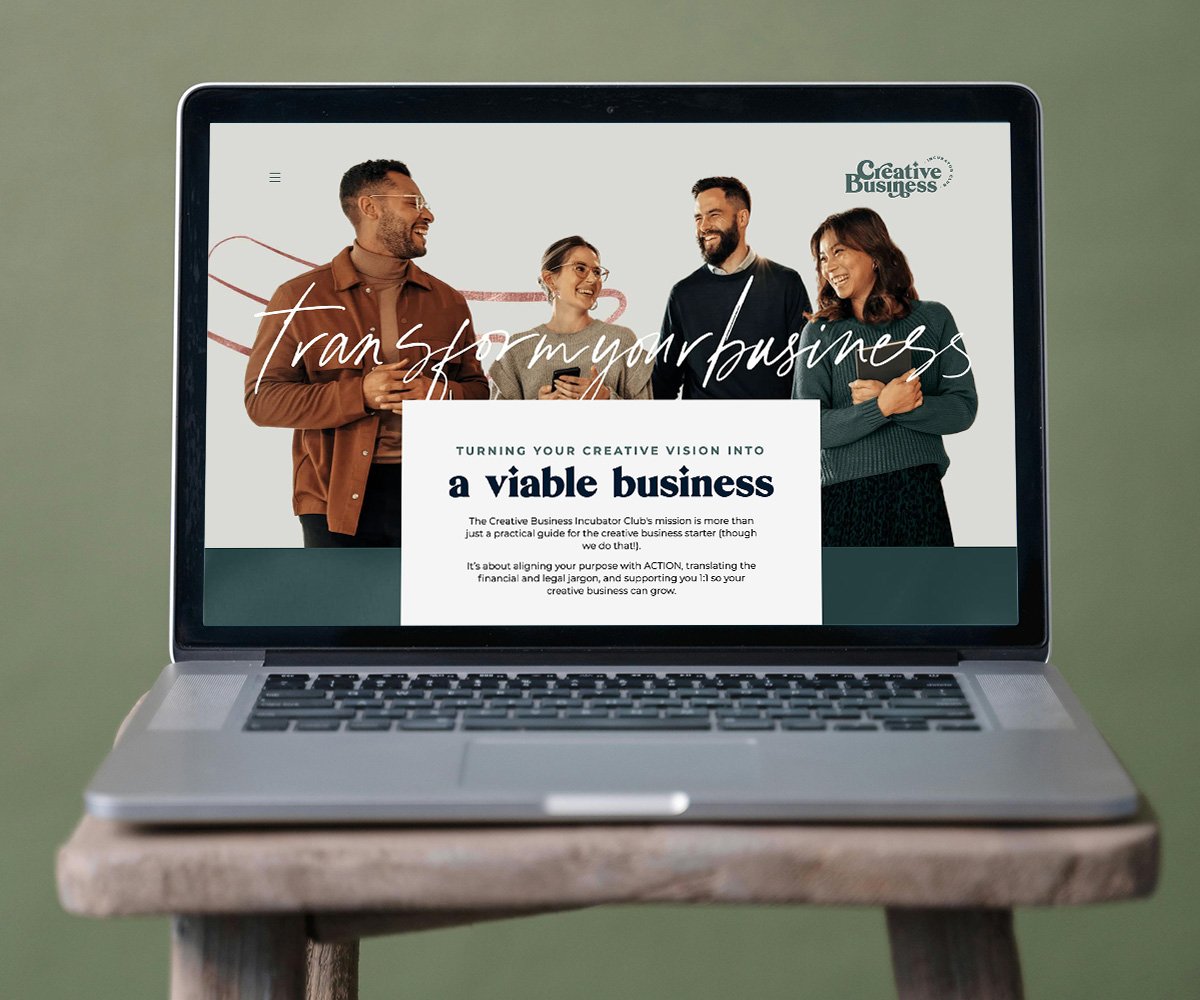
On-brand images (because you’re not like anyone else - and your ideal audience needs to know that)
Maybe we’re biased (we are branding experts, after all), but there’s nothing we love more than a brand that’s figured out how to sell and stand out while being an authentic reflection of the business owner.
Even if you’re a word nerd, visuals count for a lot when it comes to first impressions.
It’s important to be super intentional with the images you curate for your brand’s homepage. Do they fit your personality and how you want your audience to perceive you?
In terms of visual hierarchy on the page, make sure the visuals complement, don’t distract from the important messages you want to convey.
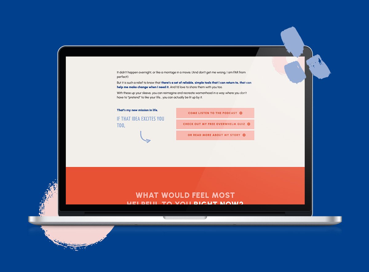
Must-click calls to action
Here’s the thing: You want your website visitors to feel excited enough to keep clicking and read more - nudging them ever-so-seductively through your sales funnel to buy from you (or at least follow or sign up to your newsletter).
You can’t do that with a lazy call to action like *shudder* ‘Submit’.
Make sure your calls to action are action-packed and persuasive.
In terms of design, call to action buttons should be user friendly, big enough to stand out (but not too big), and contrast with the rest of your design for max impact.
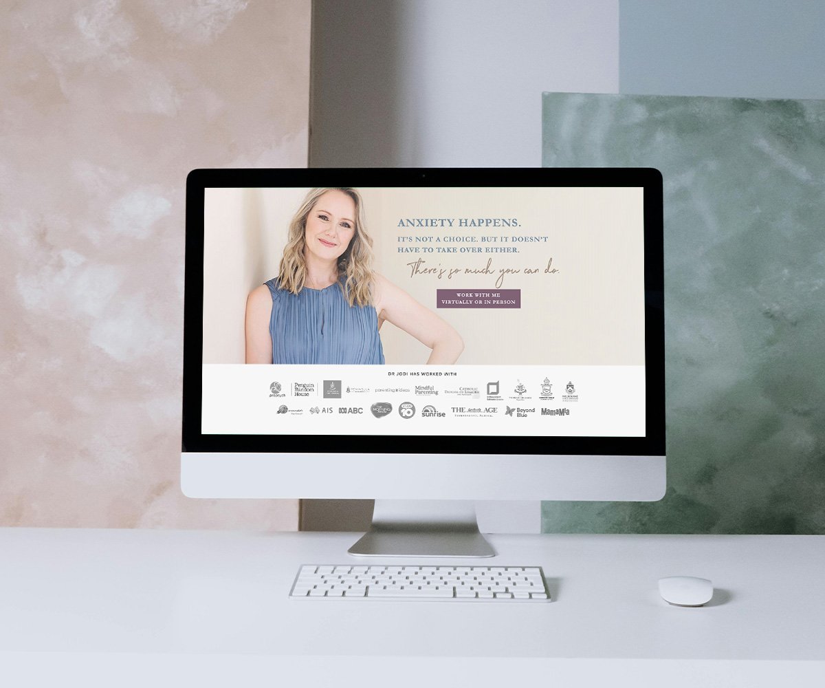
Social proof in spades
By social proof, we mean proof that other humans trust in you and enjoy your work. Think reviews, written testimonials, video testimonials, and screenshots.
If you’re missing these, you’re gonna have a hard time convincing new readers to buy from you.
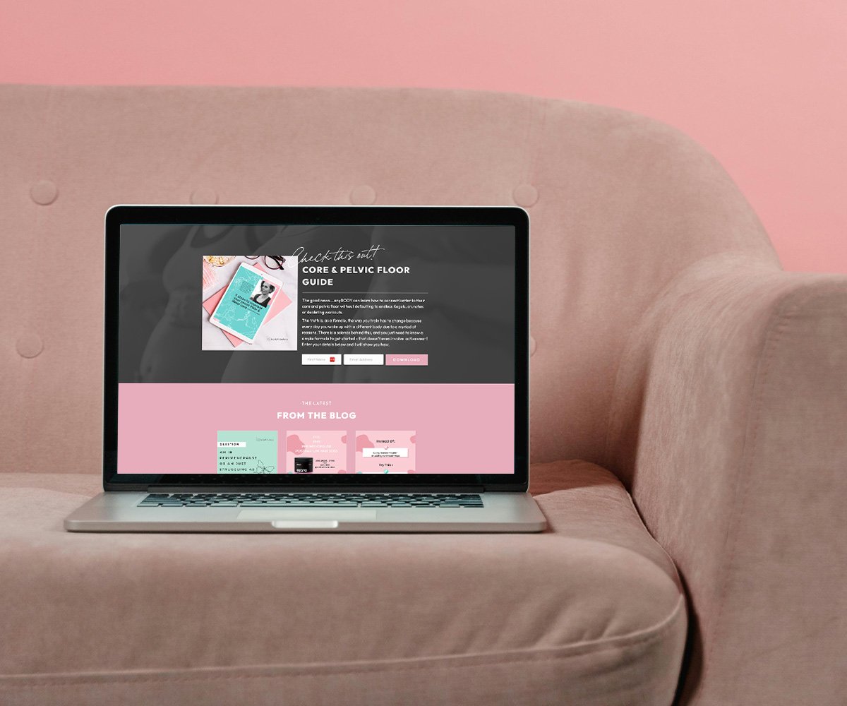
A tempting lead magnet
Do you have a clear and enticing offer for new subscribers to your email list? And if so, is this displayed prominently on your homepage?
We have lots to say about lead magnets and picking the right one for your sales funnel. After all, this is one way you’ll build a relationship with your audience and future readers.
But the most important thing to know is to make it clear and compelling on your homepage.
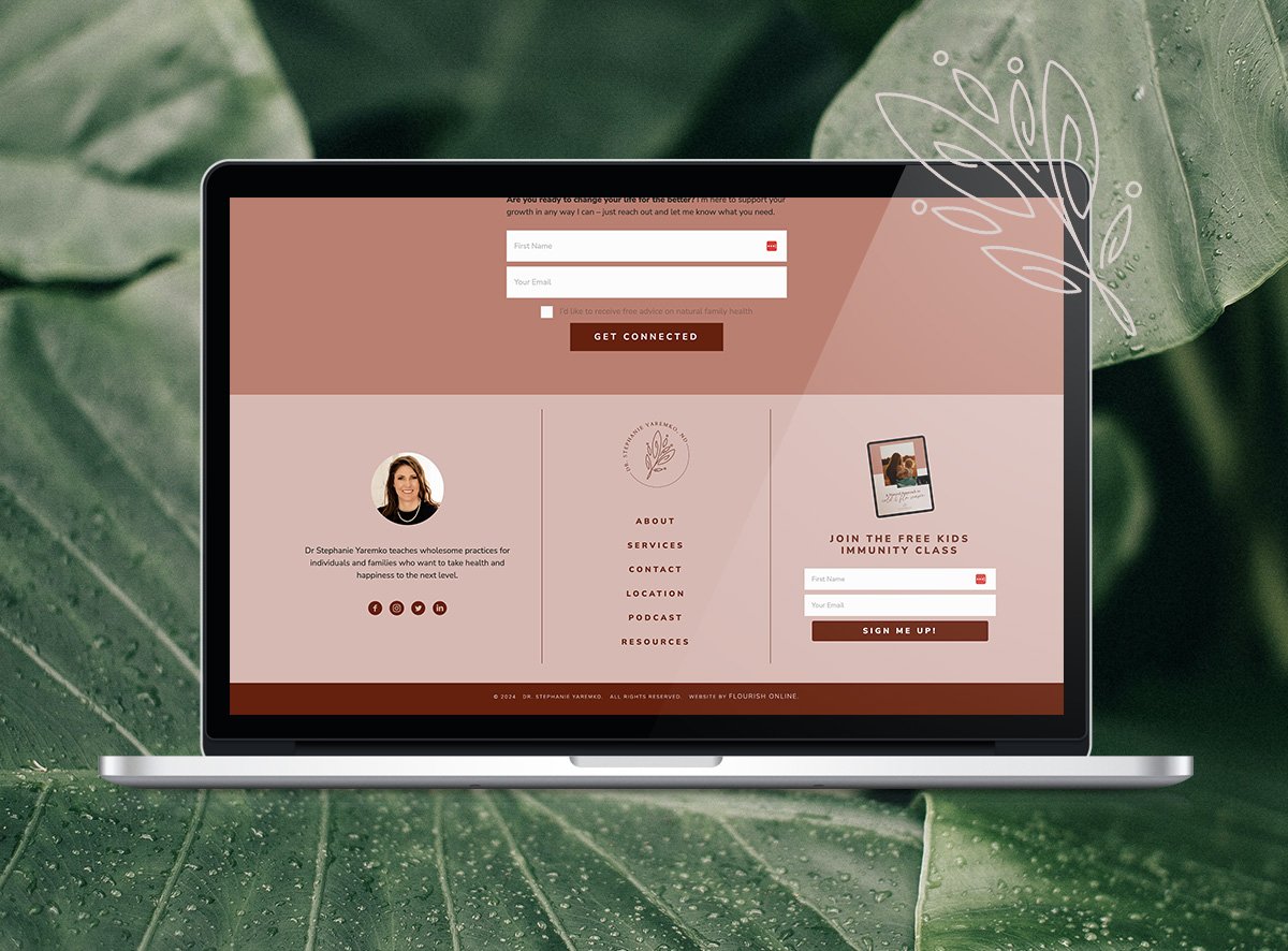
Clear navigation
Is your author website easy to navigate?
First things first: What’s the top goal you’re driving your readers toward? Would you like them to buy your book, sign up for a program, sign up to your email list, or something else? Your chosen goal will impact how you design the user experience.
Proper type hierarchy can help your website visitors understand what’s important and reduce confusion, so there’s no delay getting around.
Ideally, links in your header and footer will have consistent typography and sizing. Another good rule of thumb is to make sure you have no more than seven top-level menu items (if you have a horizontal nav bar).
If a new brand or website feels like what you really need to step up your game, let's dance! Take our quiz now to discover your brand archetype so you can build the right strategic foundation for your brand and website.

Take our quiz now to discover your brand archetype so you can build the right strategic foundation for your online presence.


